Rationale
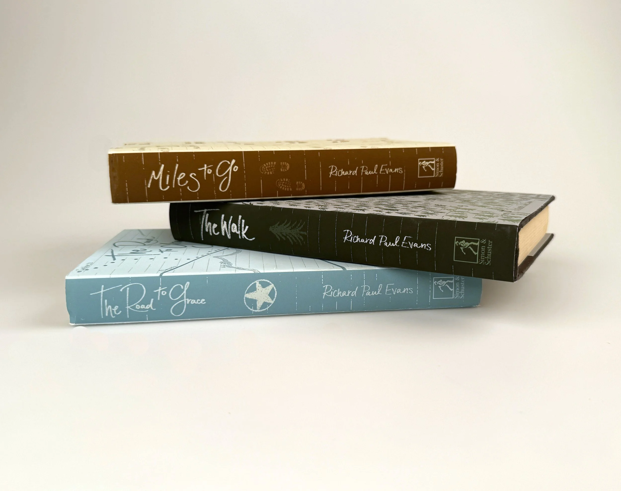
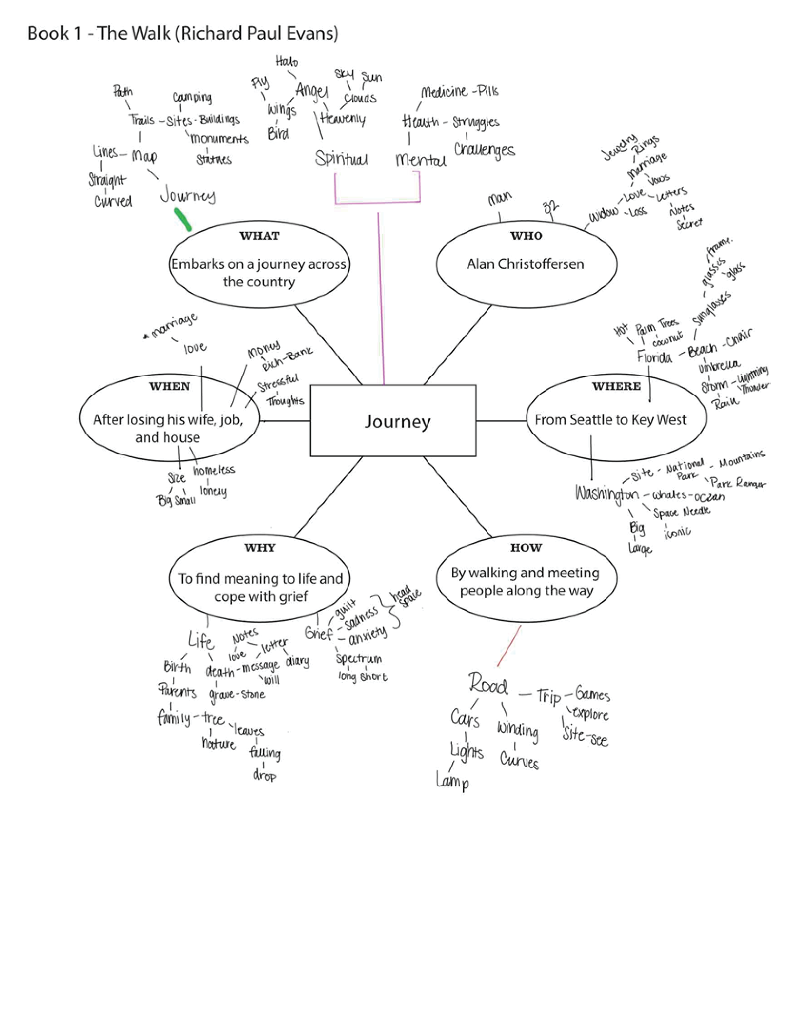
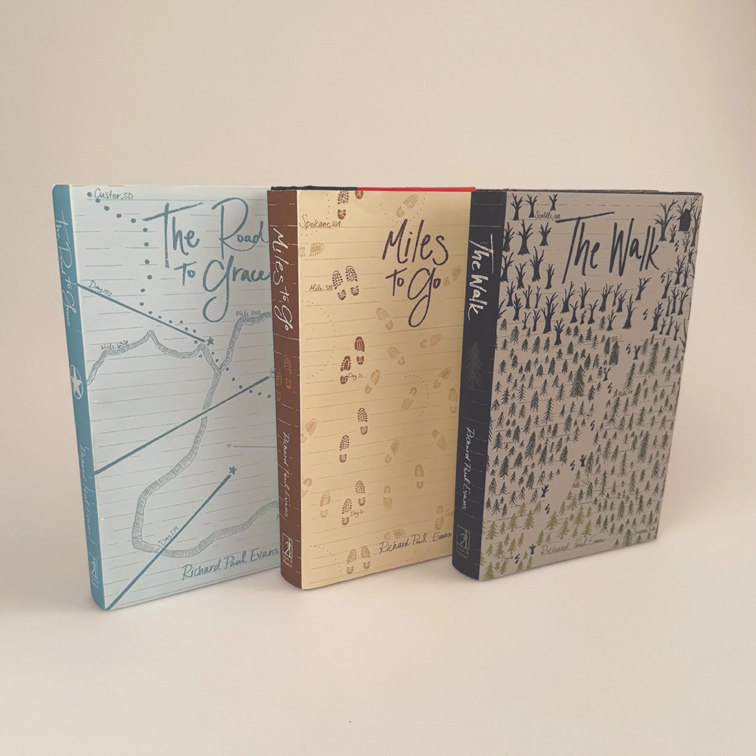
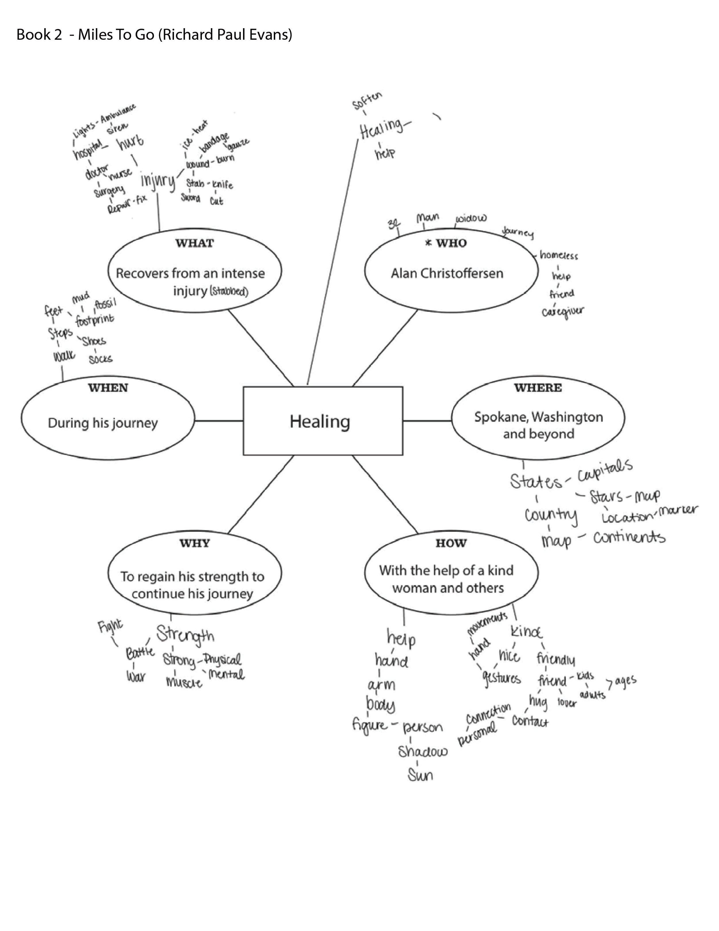
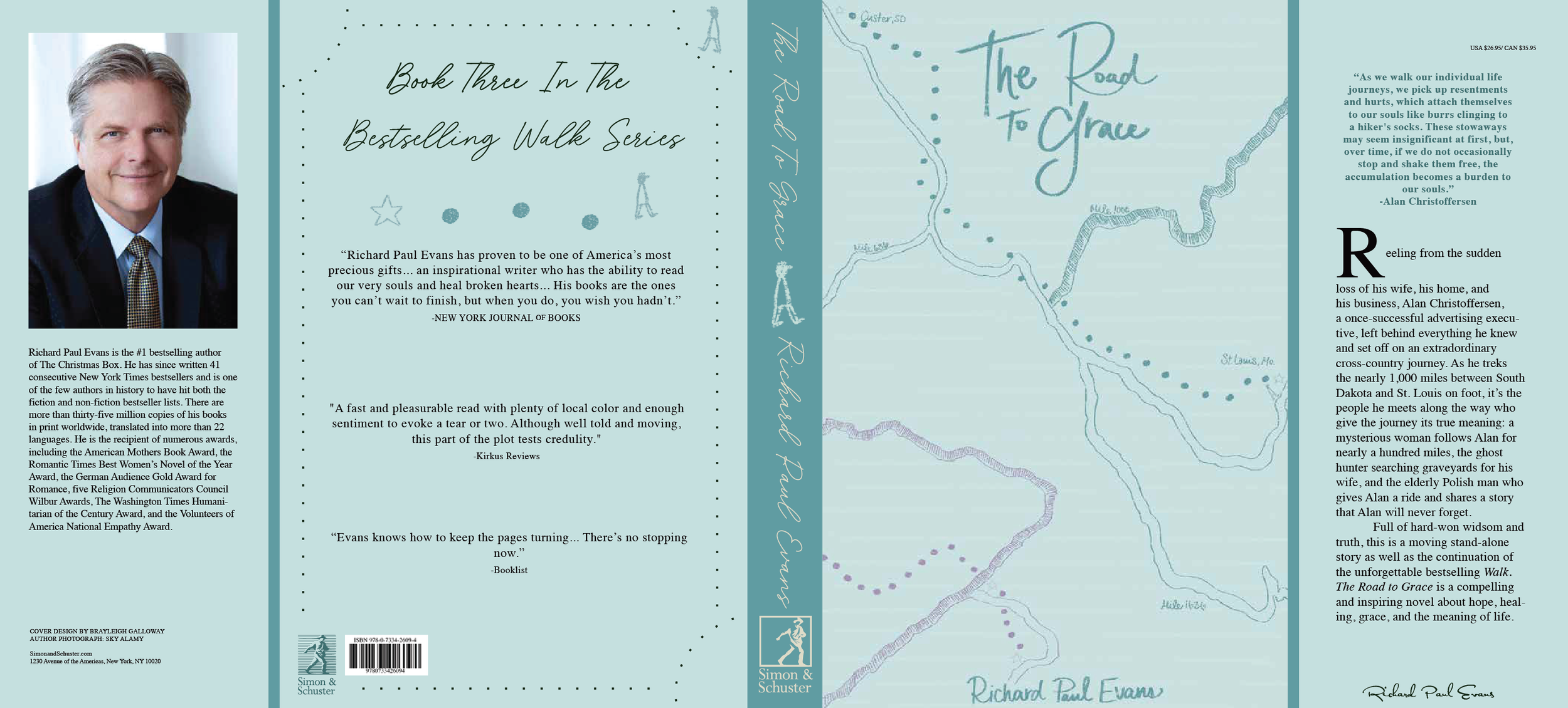
The book series I chose for this project is called “The Walk Series.” The books in order are “The Walk,” “Miles To Go,”and “The Road To Grace.” These books follow the journey of Alan, a man who lost his wife, his house, and everything he loved. He decides to leave his old life behind and start a new one. Doing so, he walks from Seattle, Washington, to Key West, Florida, meeting many people along the way. They share stories, walk with him, and help him become a new man by the end of the series. This is a five book series but I only designed the first three for this project.
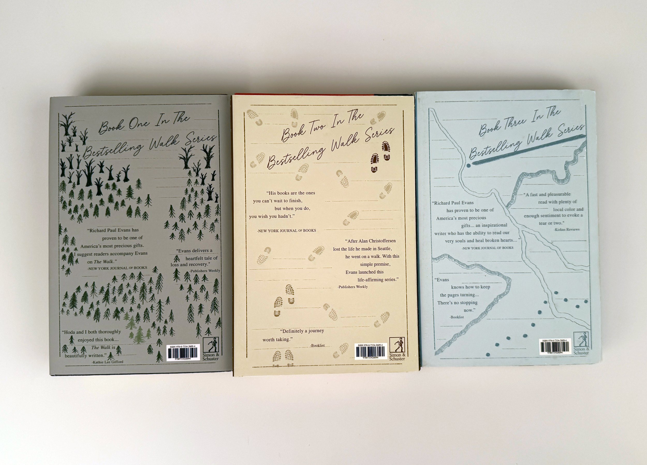
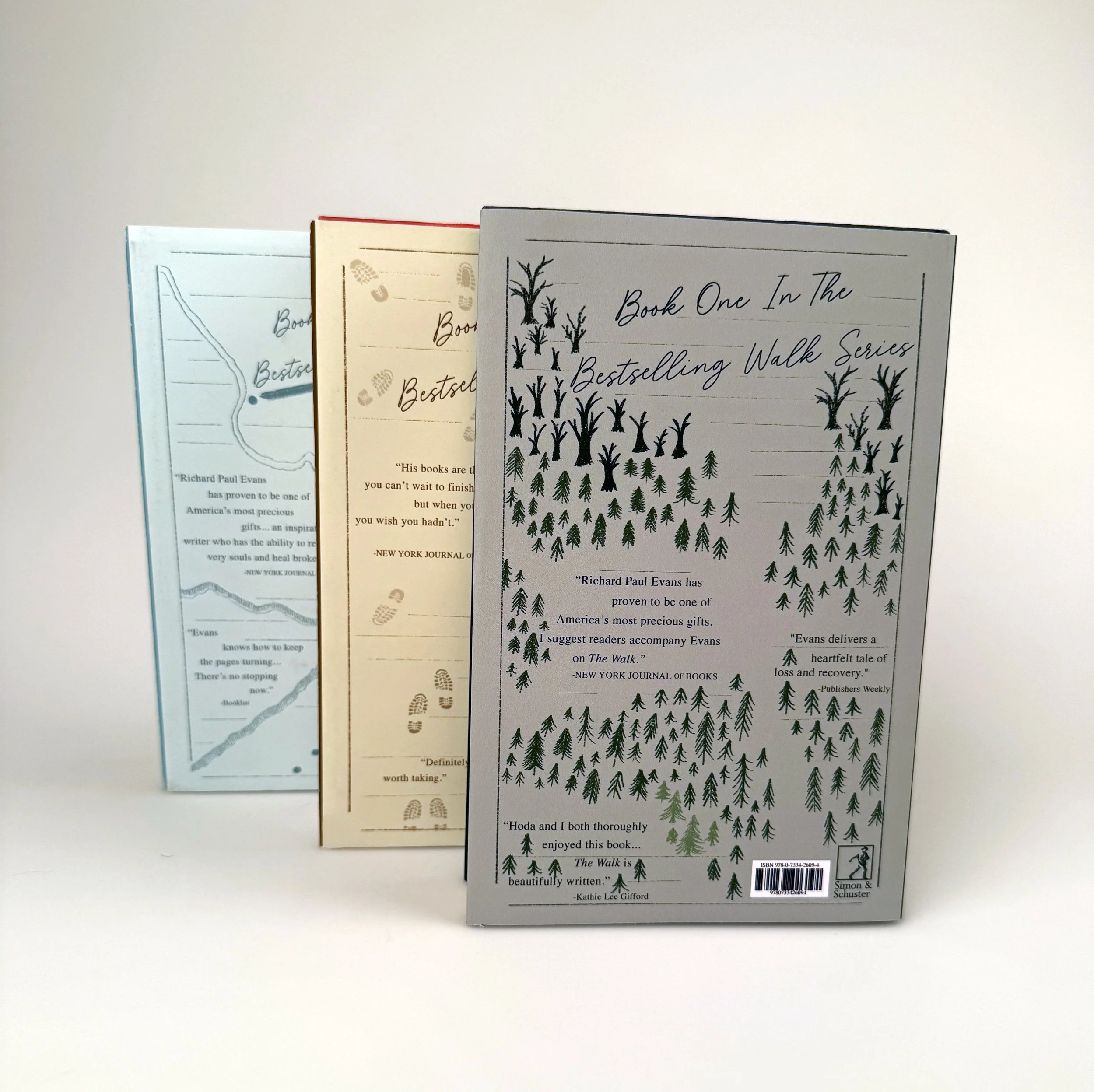
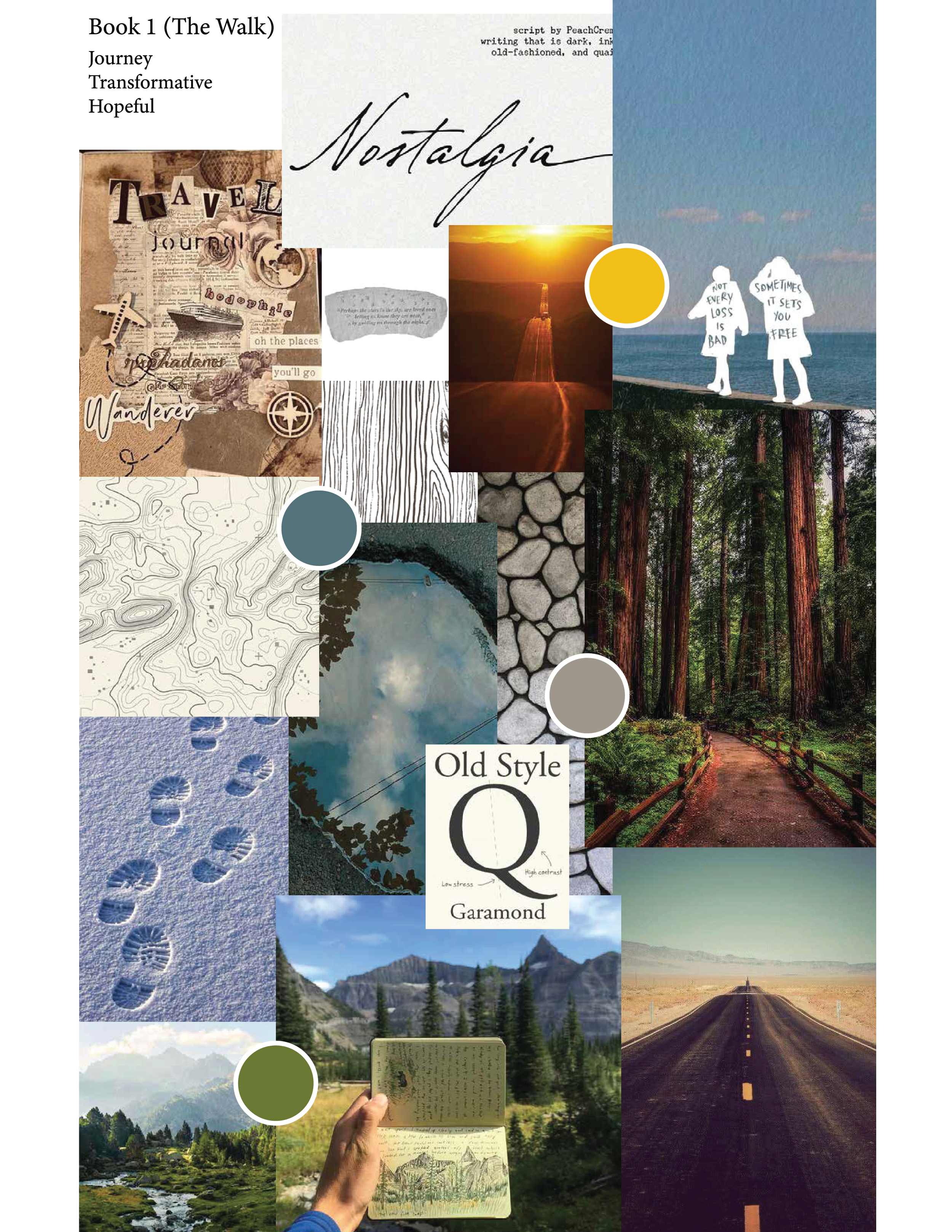
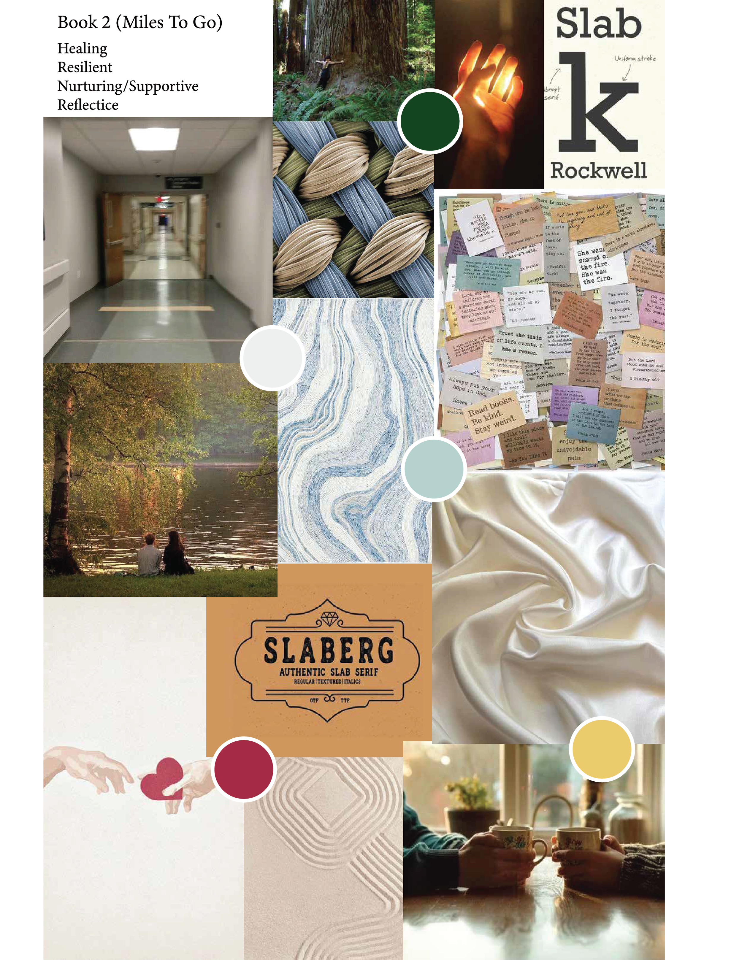
The design approach was inspired by the books main themes, focusing on the different journeys that he faces in each book. The first book is focused on him leaving and the story behind why he’s leaving. The second book immediately follows this story but the design for this starts to show chaotic and sporadic footsteps reflecting on the crazy journey that he goes through in this book. The third book reflects his diary and the map that he keeps, showing the longest walking journey stretch that he goes through in the books. Along the journey in this book he starts to forgive others and feel more peace through stories of the people he meets along the way, this is captured through the colors used in the design to show a sense of calm and peace.
Full Process
Research
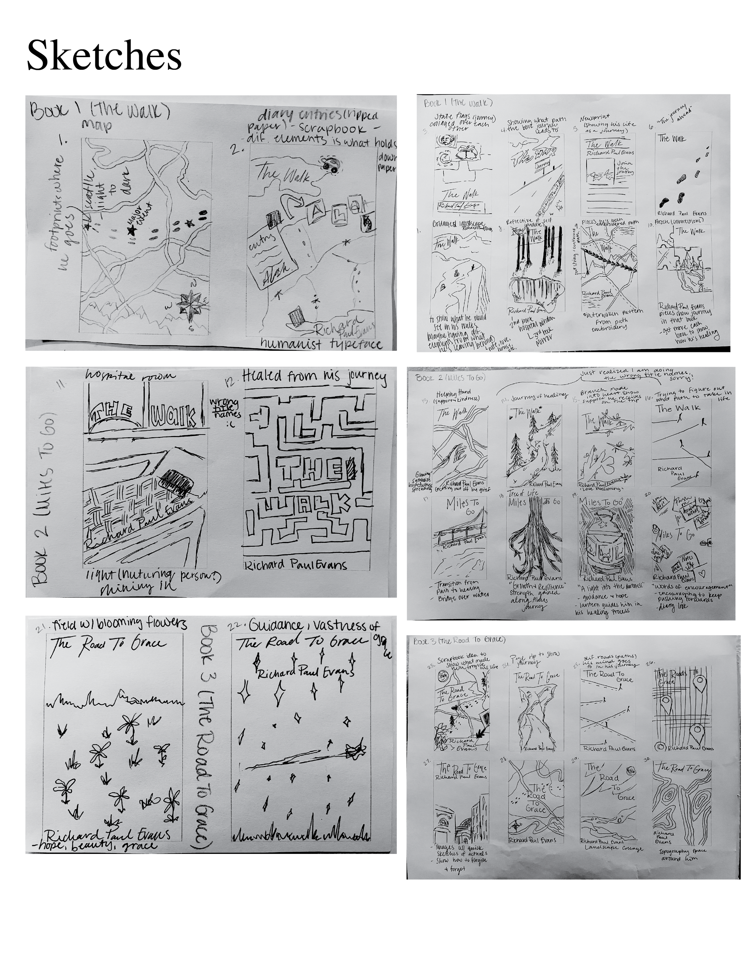
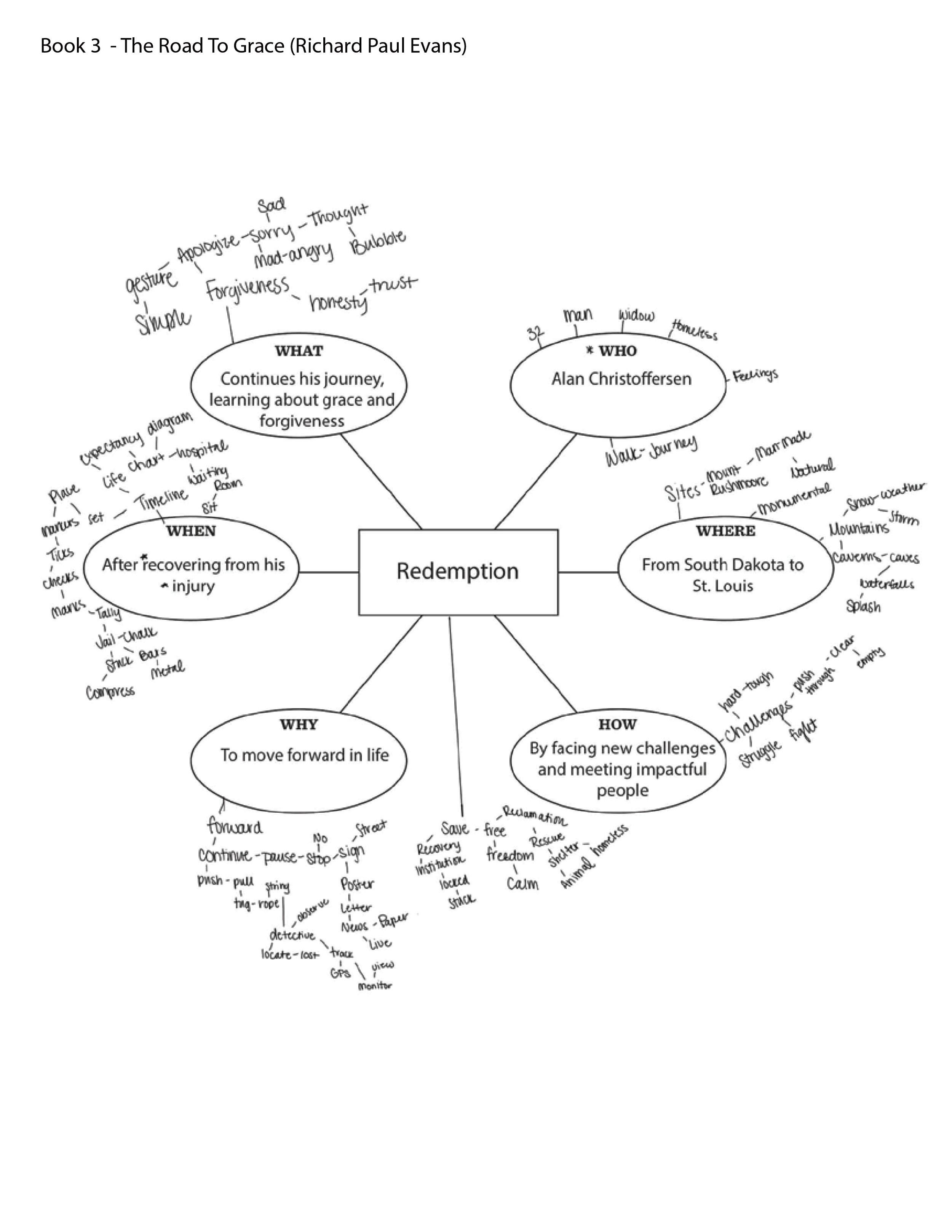
For my research, I started by going over book series that I have read and enjoyed reading. I found a five book series called “The Walk” by Richard Paul Evans that I read when I was in high school. I really enjoyed these books so I chose these and got them approved to continue working on them. I reread the first three books and took notes over when the book happened, who the characters were, the settings, etc. I then made each book a mind map and started working on thumbnails from that.

Mood Boards
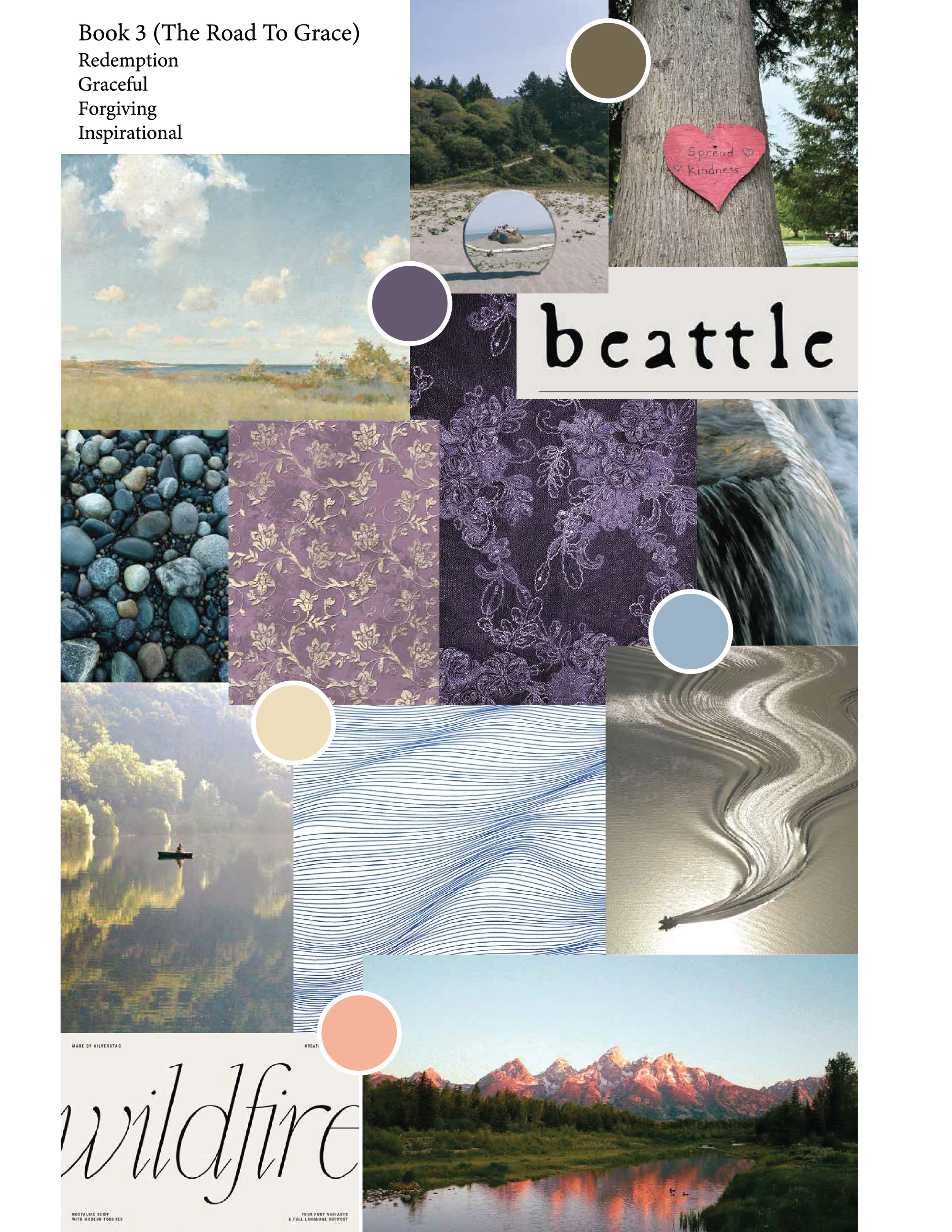
For my moodboards I looked at my mind maps and chose what theme they conveyed and made the moodboards from each of those. They were all supposed to be inspired by nature to stay on theme with what I wanted my covers to look like.
Sketches

Iterations
Final Books
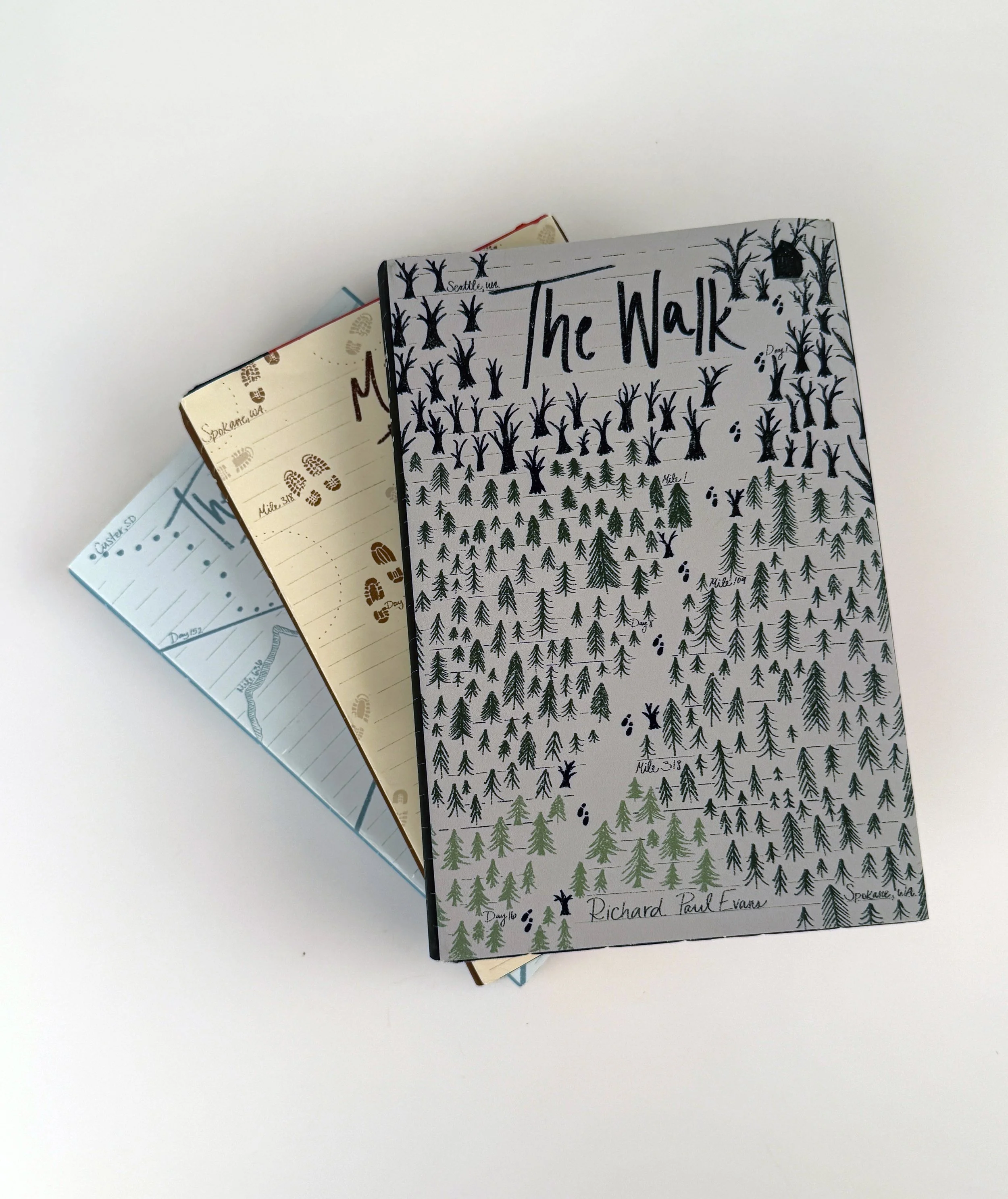
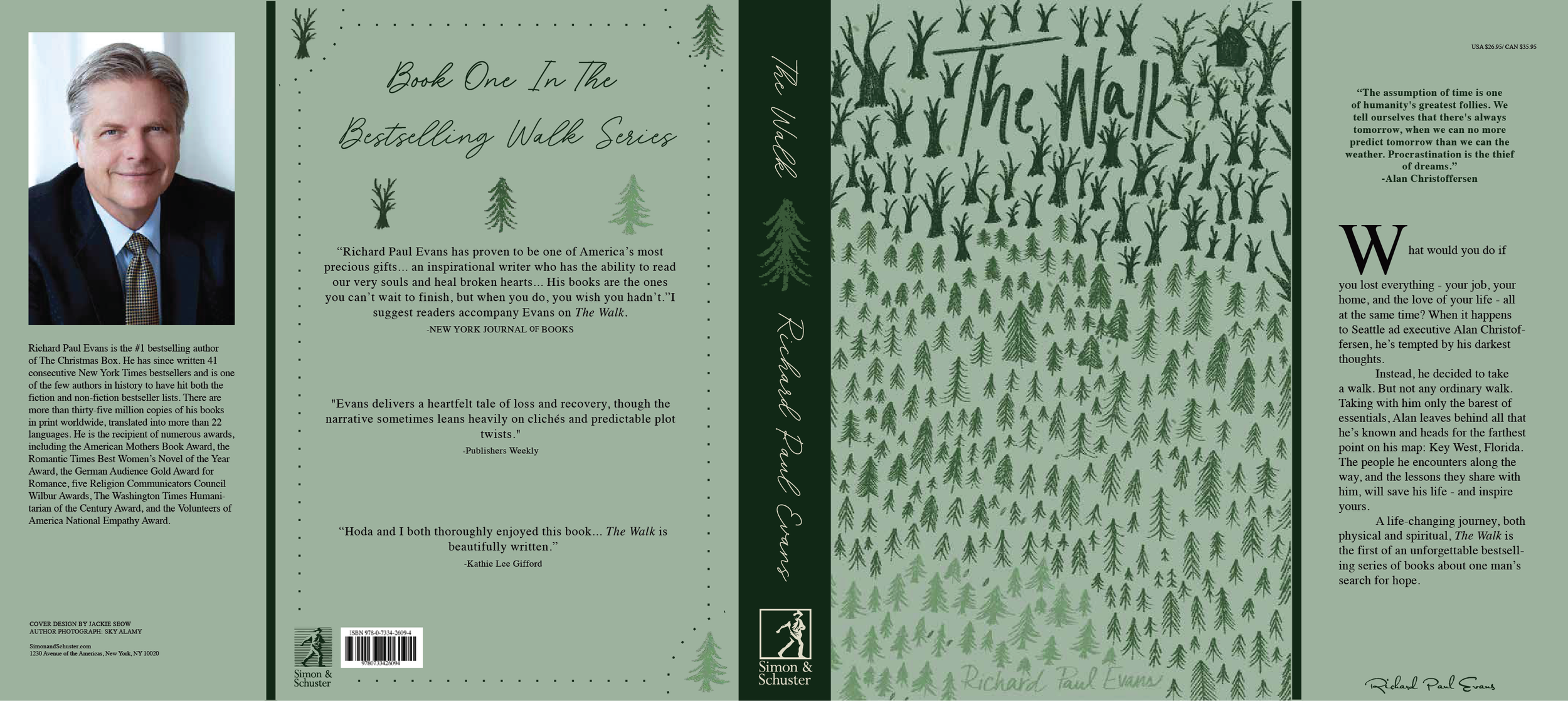
For my first iteration of this book I wanted to show the physical area that he was in, in this book. I chose green for this book because I wanted to stay with a natural color scheme. For my notes I needed to show the time, add some negative space and make the footprins more noticeable. I also wanted to add lines to make it feel more like a notebook since my character keeps a diary in the books.
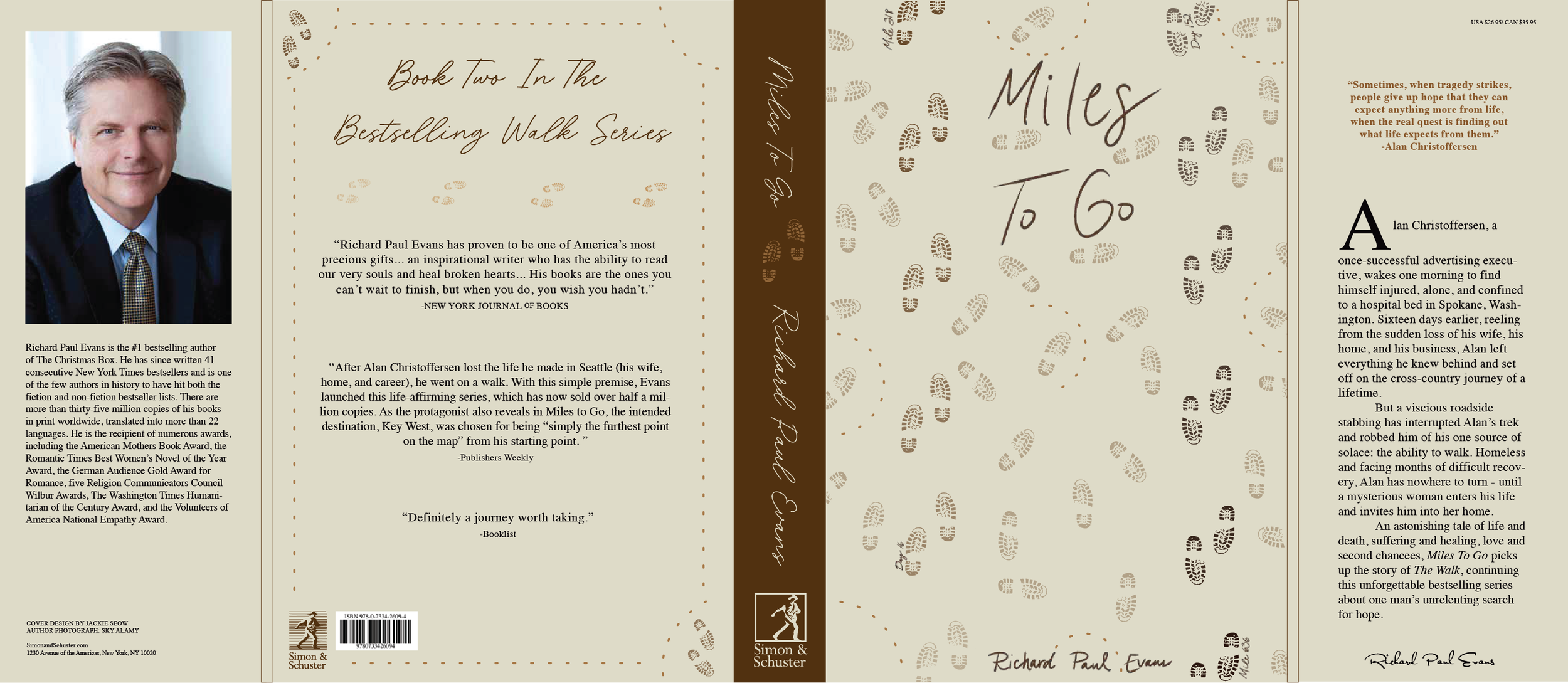
For my first iteration I wanted to show his footprints for a physical journey. I wanted a more desired path on the left and right areas to show the specific path I wanted him to go down. For my notes the title was too soft and not every path needed to be perfect. I also needed to show passing time but in a way that worked for each cover. The flaps also needed to be the cream color instead of the white, and the inside type needed to match for both flaps.
For my first iteration of this book I wanted to show a map to tie into the idea of his journey. I kept this book light and soft since this is the book of him starting to heal and meet people that he says he will remember for the rest of his life. For my notes, I needed to try and use elements of lines that I had make in my original sketches, and move the authors name up a little more. My spines also needed to have the same font as the front covers. The backs of the books also were too structured compared to the fronts so I needed to fix that. Taking a section from the front and making it work for the back is what was recommended. Also, fixing some of the quotes and alignments through the text in each book.