
Rational
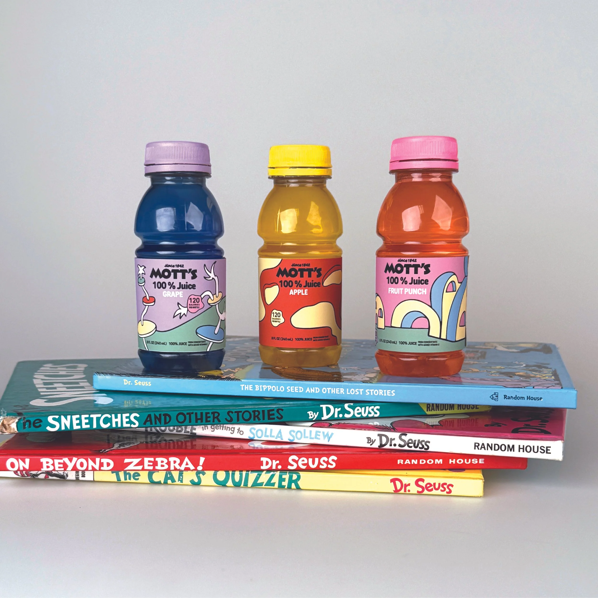
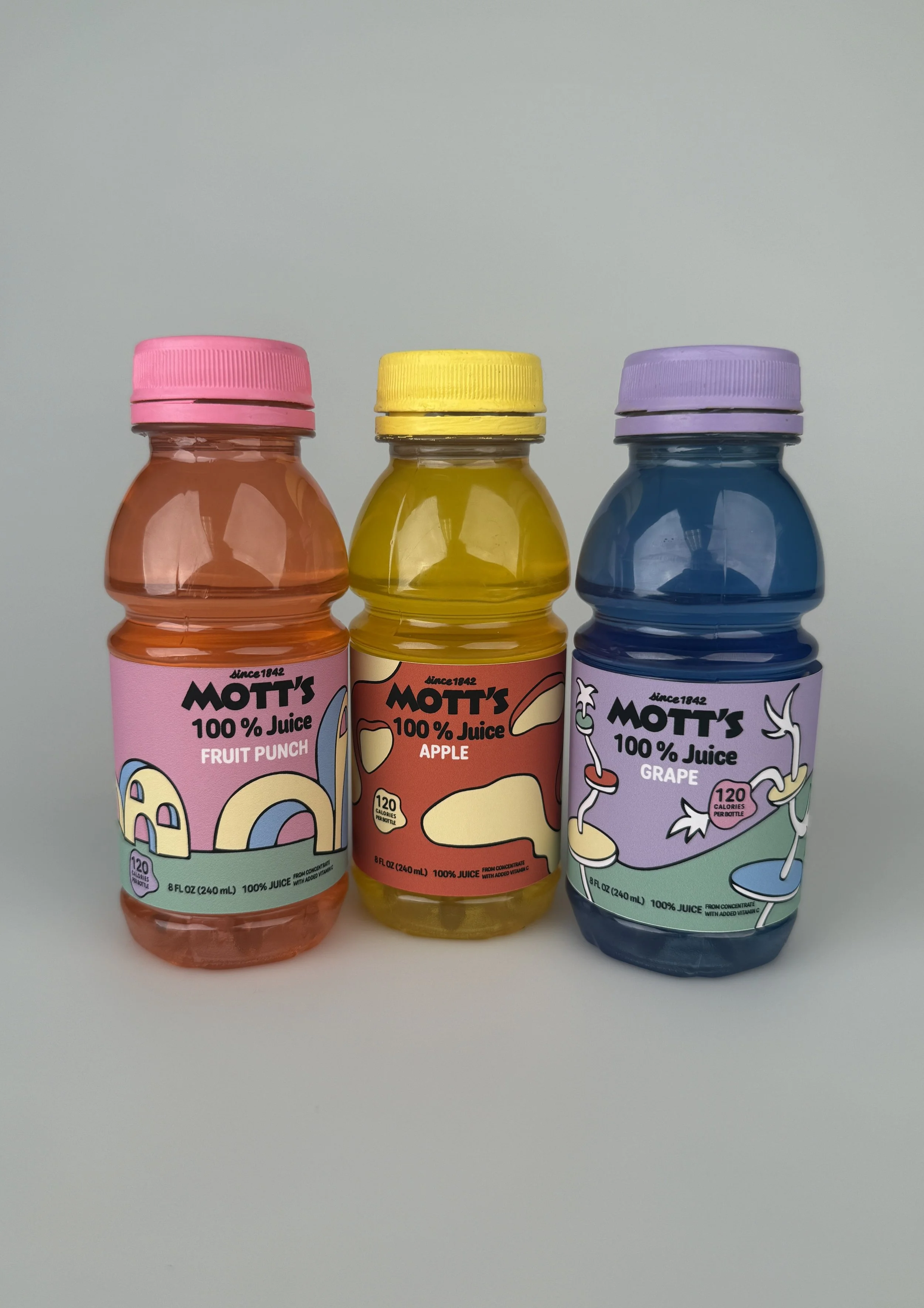
Motts label redesign is created to offer a new experience for both children and parents. It reflects both whimsical feelings for children as well as nostalgia for parents.
The design approach was inspired by Dr. Seuss’s book illustrations, focusing primarily on his architecture and landscapes. This label was meant to show a new world that the Motts branding could be surrounded by. The logo is their original logo from 1842 and the typeface surrounding it is a simple, rounded type that is legible while also being fun. The color palette consists of light pastels of blue, green, yellow, pink, purple, and red-orange. These reflect Seuss’s colors in his early works. The flavor of the juice also correlates with the background and lid color, and juice color, of each bottle and label.