Rationale
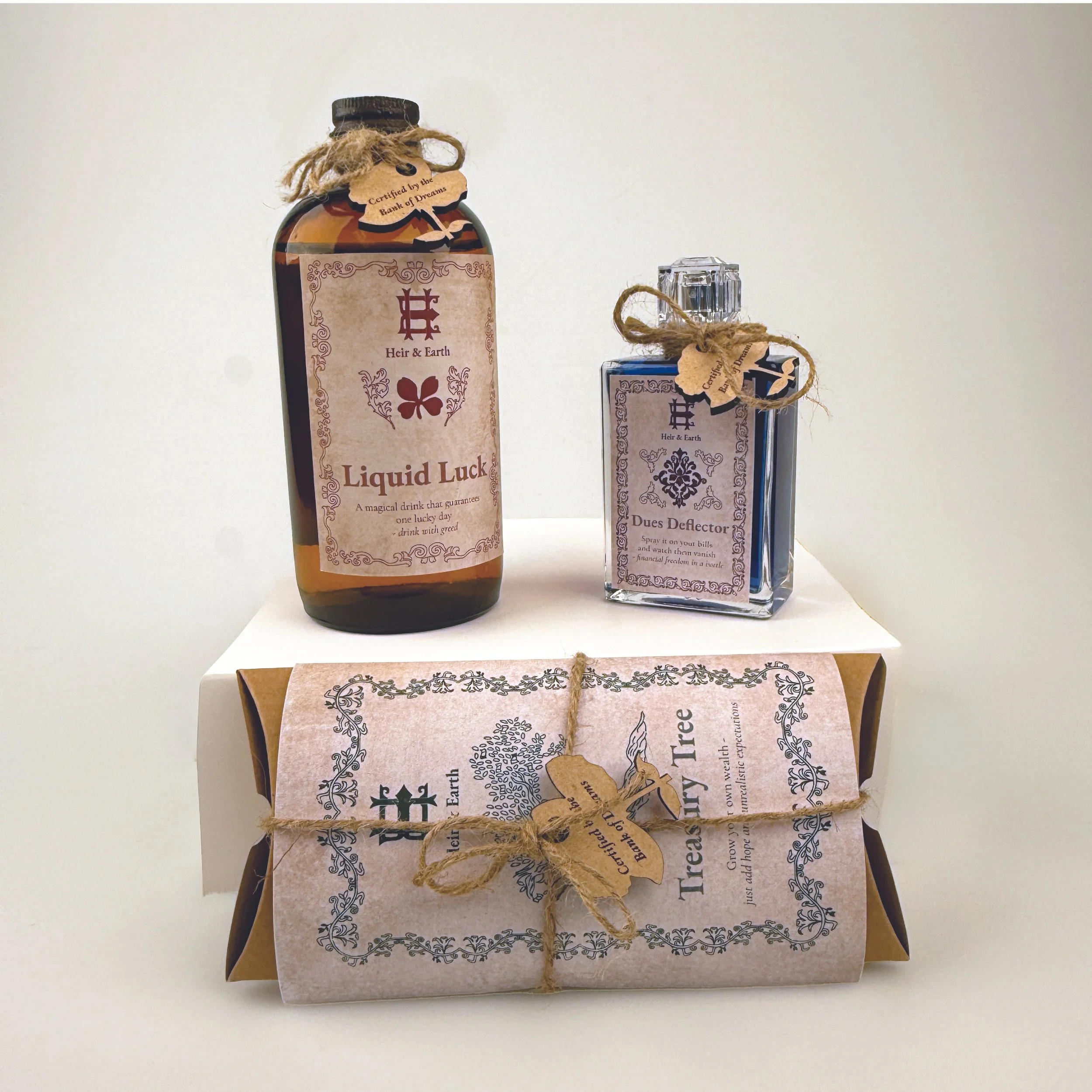
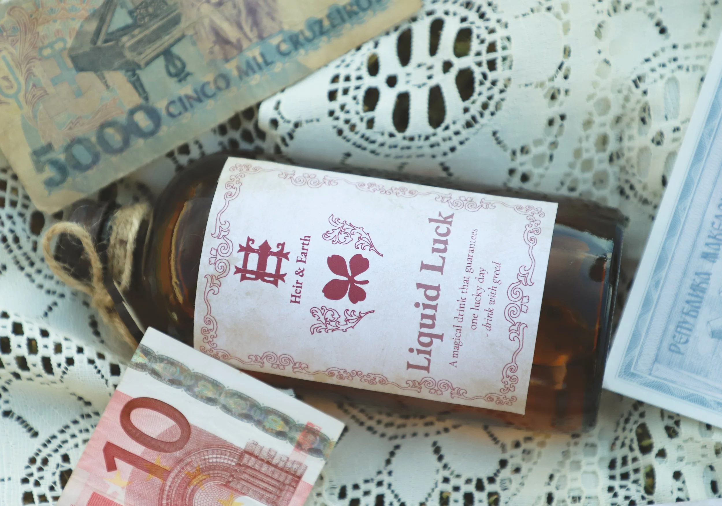
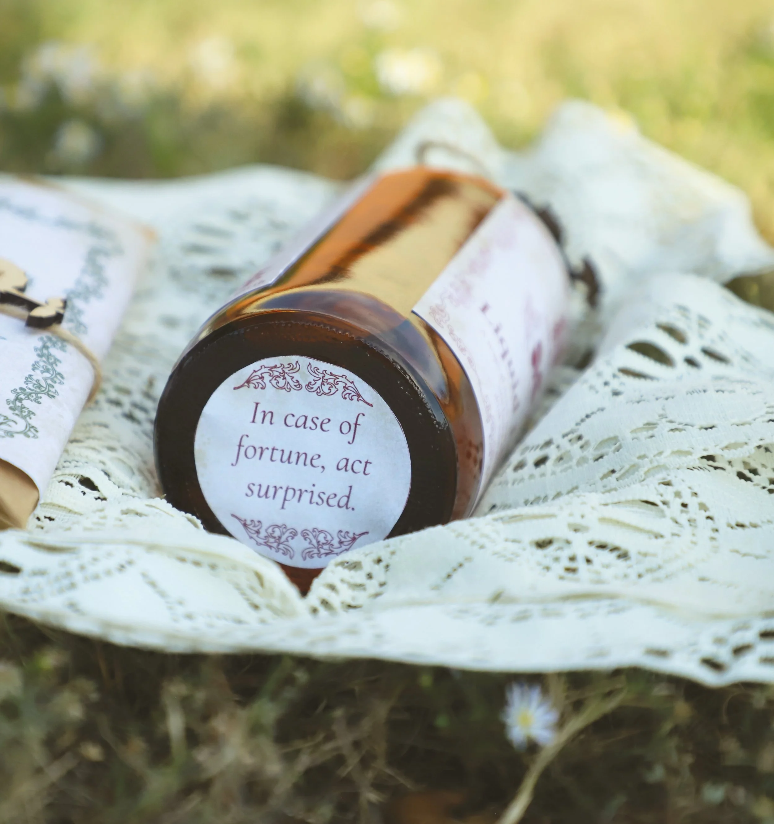
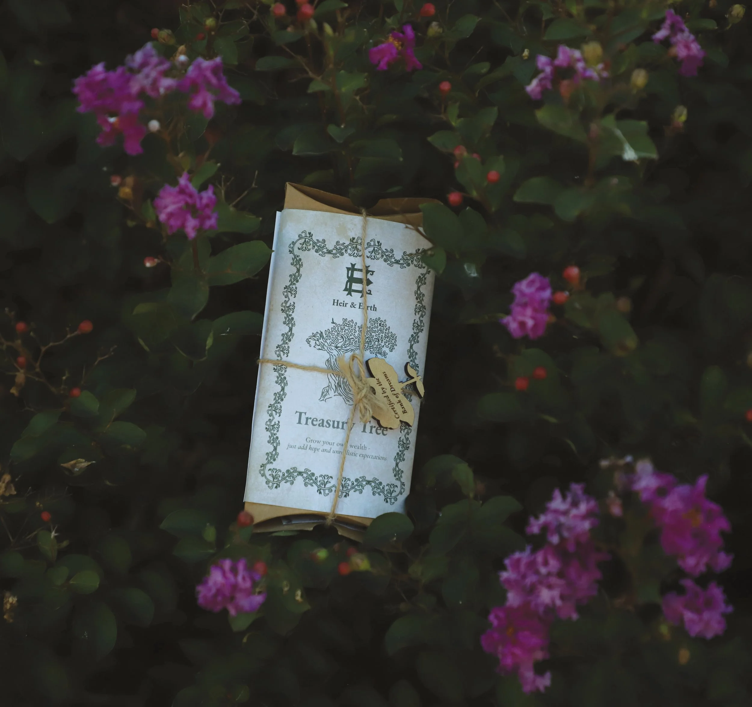
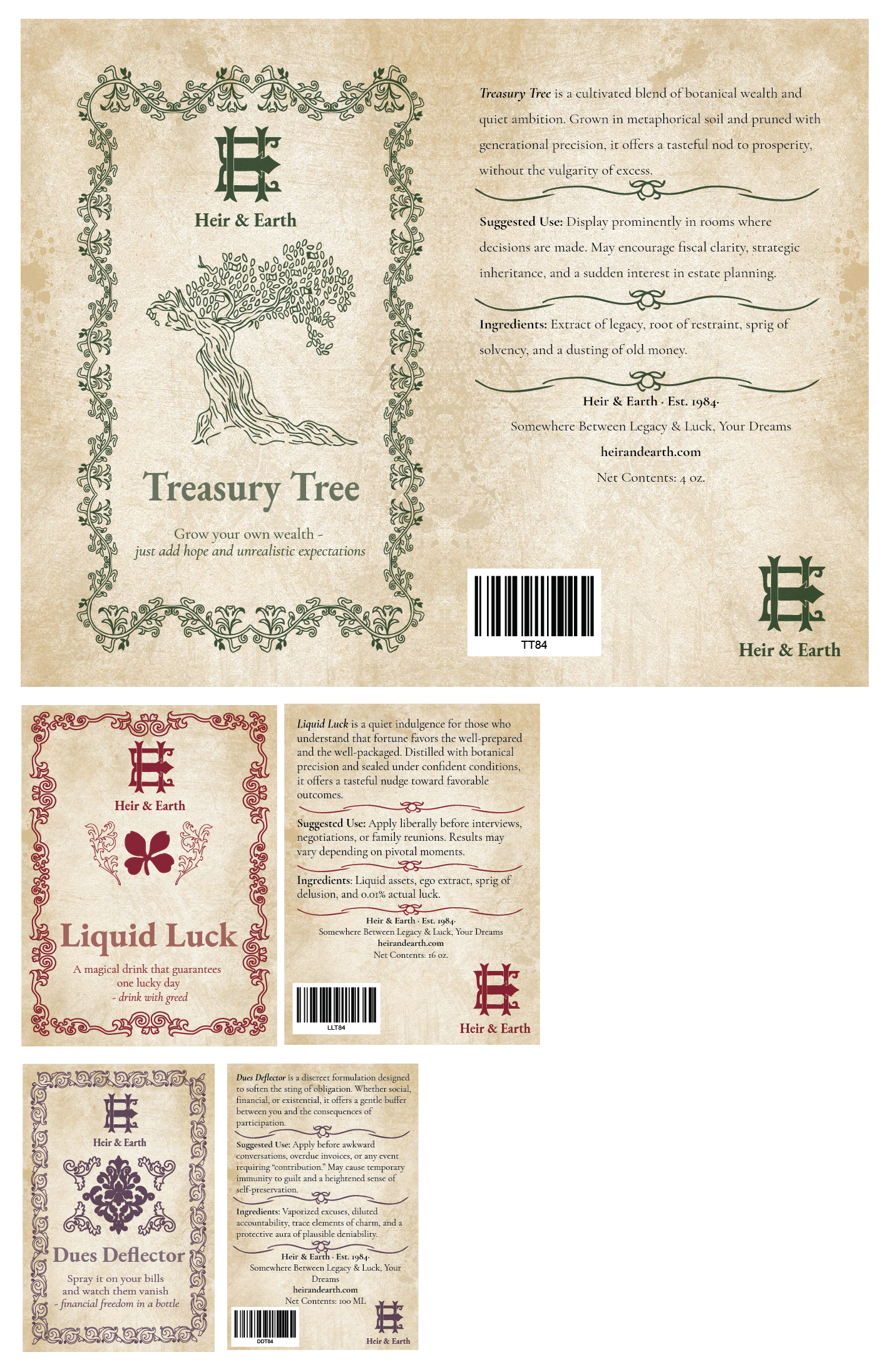
Heir & Earth is a brand created to help fix the problem of financial hardships. It offers satirical lines throughout the packaging to have a funny play on a serious problem. This brand design reflects old money and false promises.
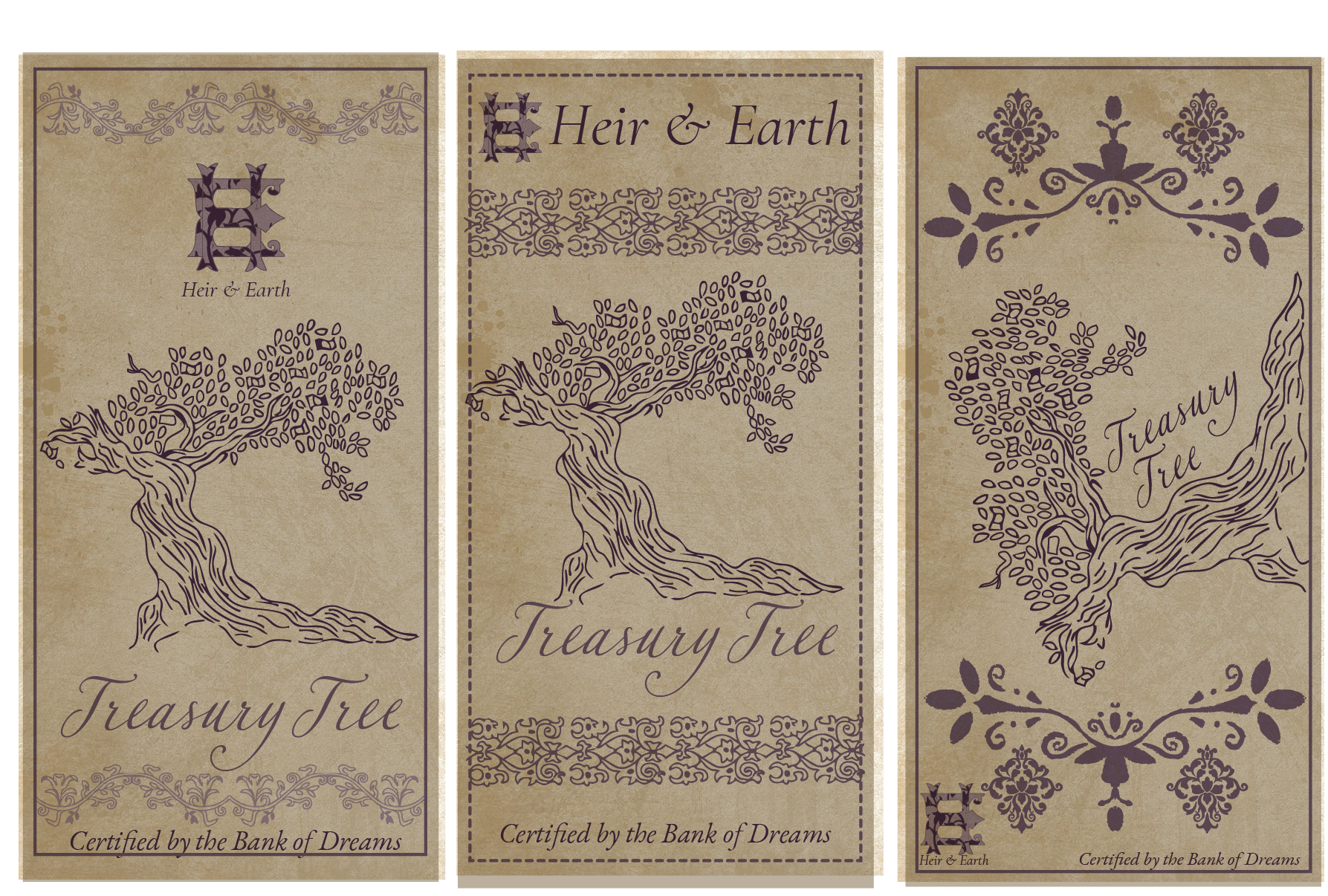
The design approach was inspired by vintage packaging, through the use of old paper overlays, and vintage inspired illustrations for each product. The logo is a monogram of the H and E combined together to resemble royal family crests to tie into the old money theme. The color palette also resembles different royal robes through time, with a deep purple, marron, and dark green. Each product has designs that match it. For example, “ Treasury Tree” shows an image of a tree of money, surrounding by flowers blooming around. Each product has its own border that matched the main illustration and has a satirical line under the product name.
Full Process
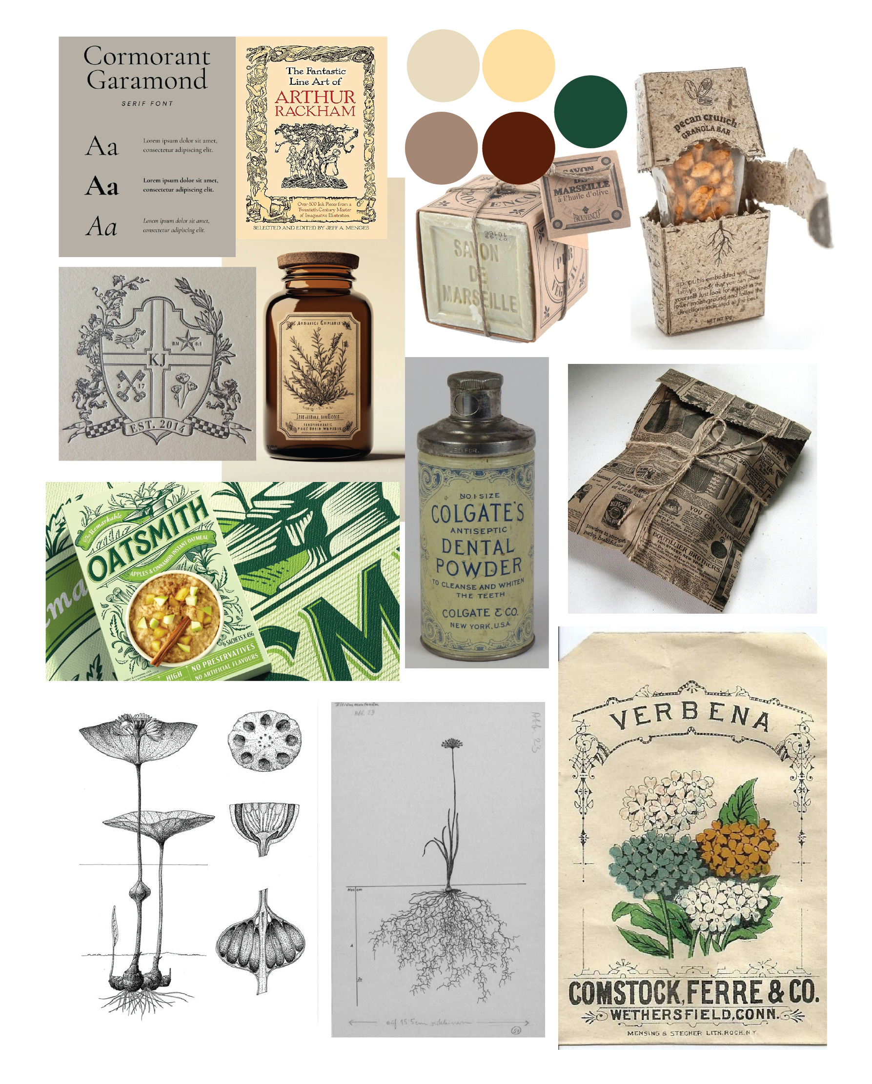
Mood Board
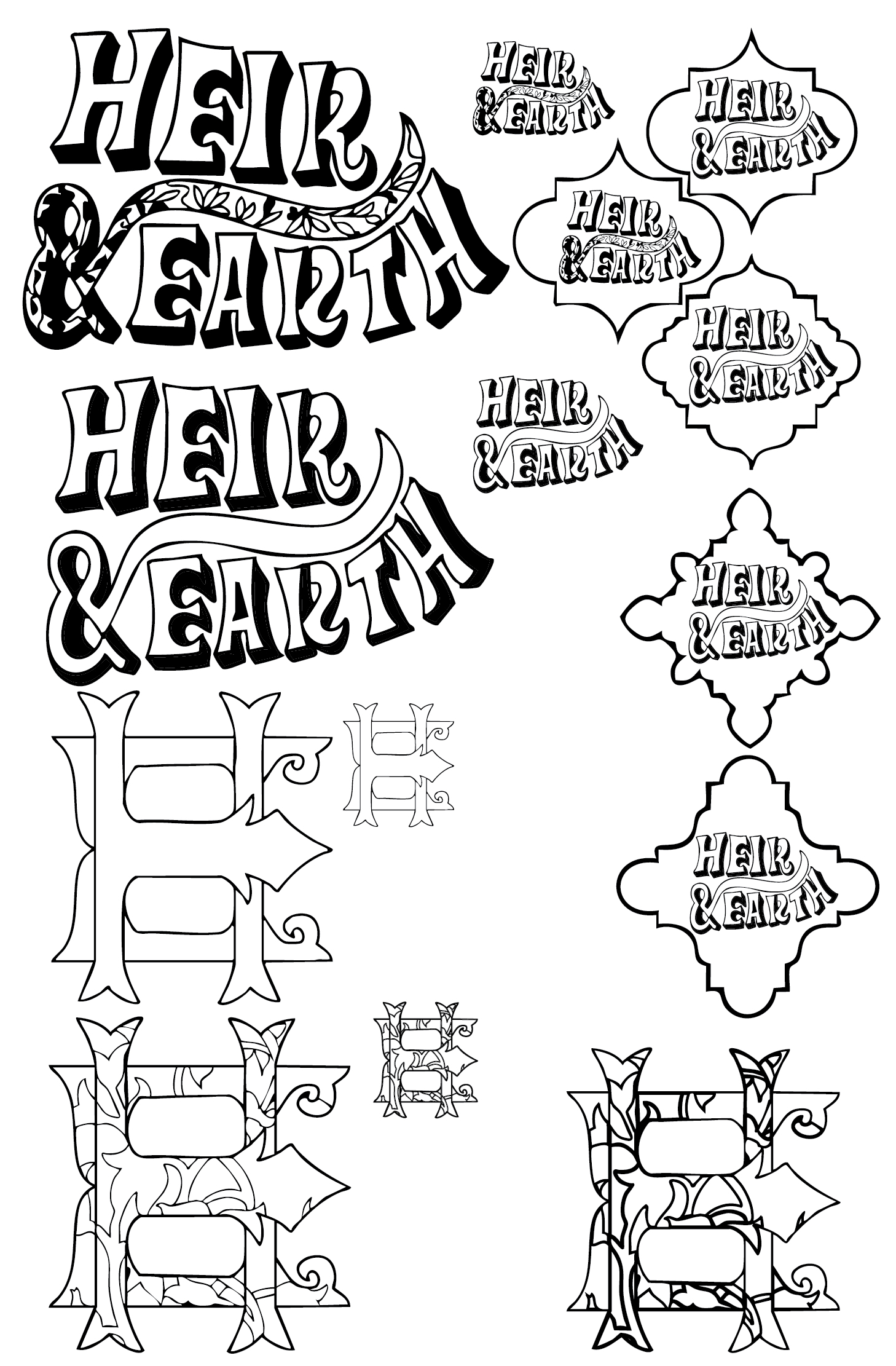
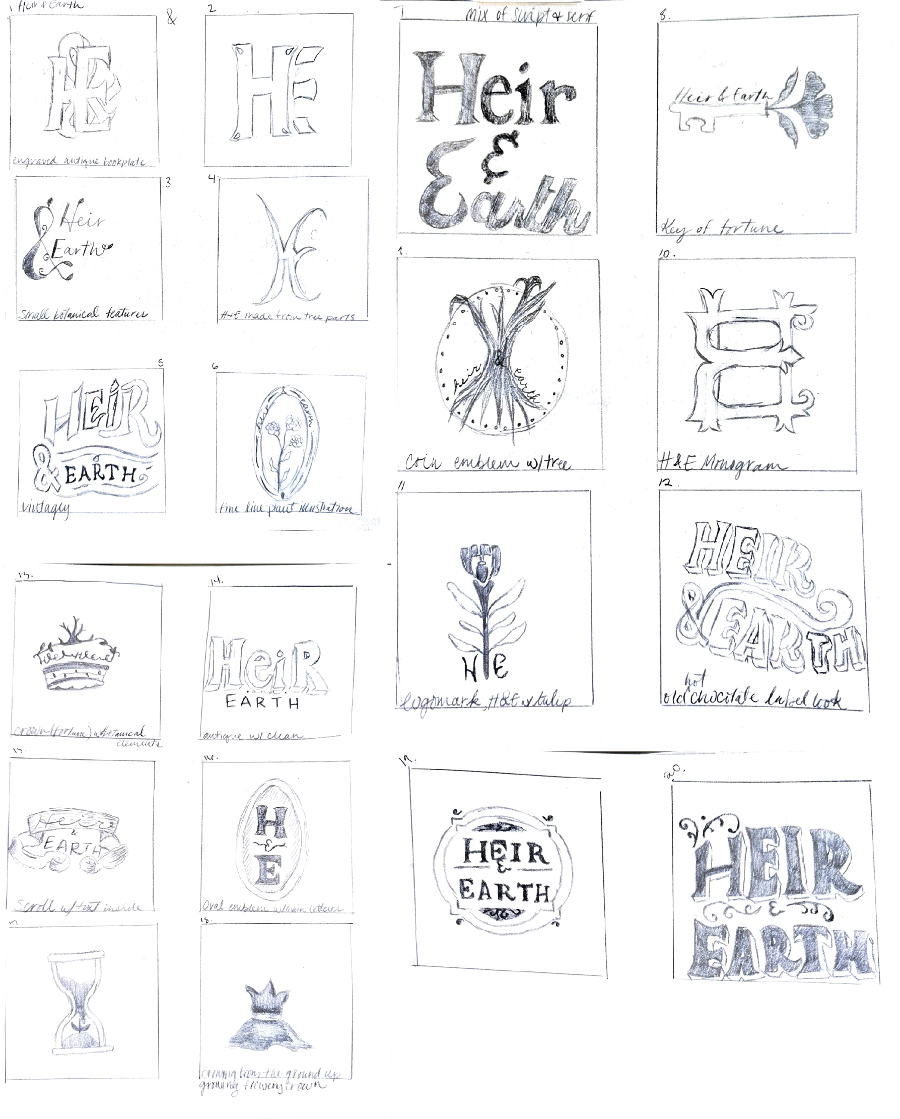
Logo Iterations
For my iterations I narrowed down the ideas to go with the idea of older antique logos as well as a royal monogram combining “heir” and “earth” by using the H and E and combined them together to make my final logo, with a little counter space in between the two letters.
Initial Products
Iterations
For my sketches I wanted to combine the royal idea from my logo and add in the botanical aspect. Doing so, I hand drew all elements and tried making them match their product names. I added the information onto the surface of what the product does, as well as a tie to the satirical element with “certified by the bank of dreams.”
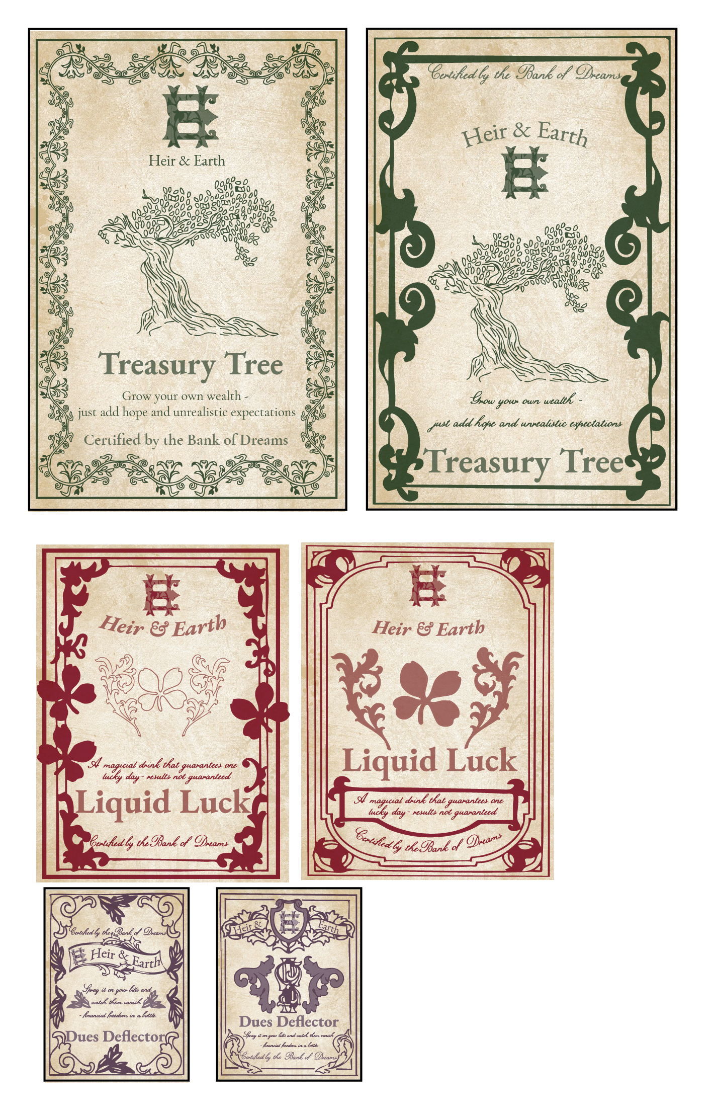
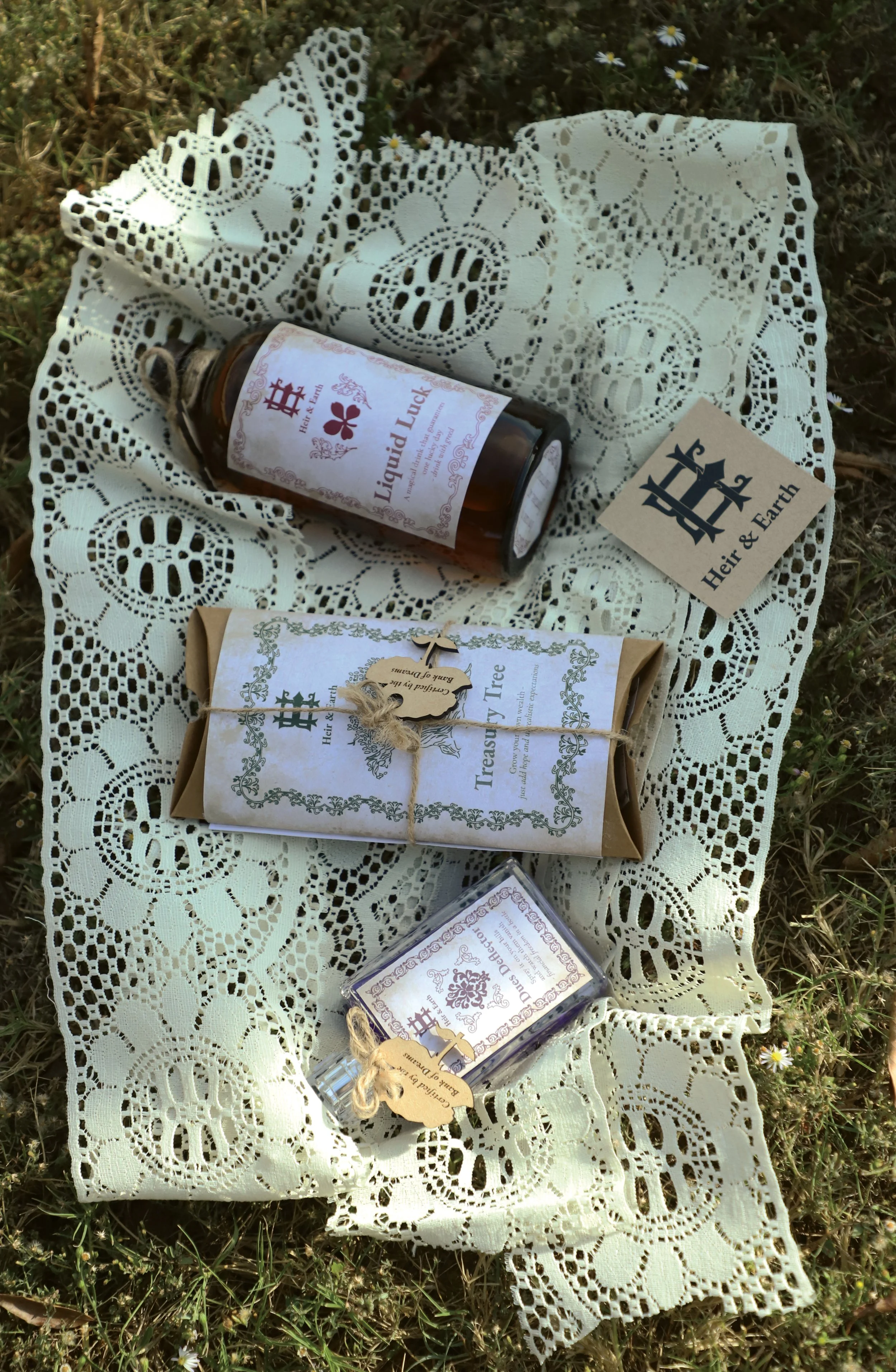
For my sketches I was trying to bring the idea of the treasury tree by showing what it is and then adding “Certified by the Bank of Dreams” as an additional element. I wanted each product to use a different royal color and match the logo to the color for that product. I also added an aged texture over the designs to tie into my idea of the products being from “old money.”
Logo Sketches
For my sketches I was going for more of a royal feel, with a tie to royal crests. I also wanted to incorporate more botanical illustrations into my logos and make that work within the word marks.
Final Logo