Rationale
Play-Doh has been around for decades and is a widely known kids toy, and their nostalgic packaging is what sets them apart from other brands. This rebrand is meant to keep the nostalgic feel of the brand while incorporating a new modern and fun touch, to stand out even more against similar products.
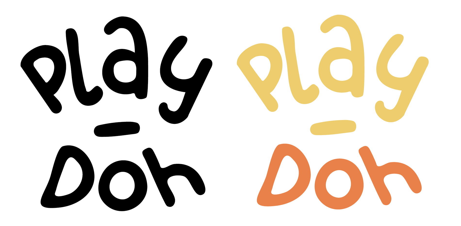
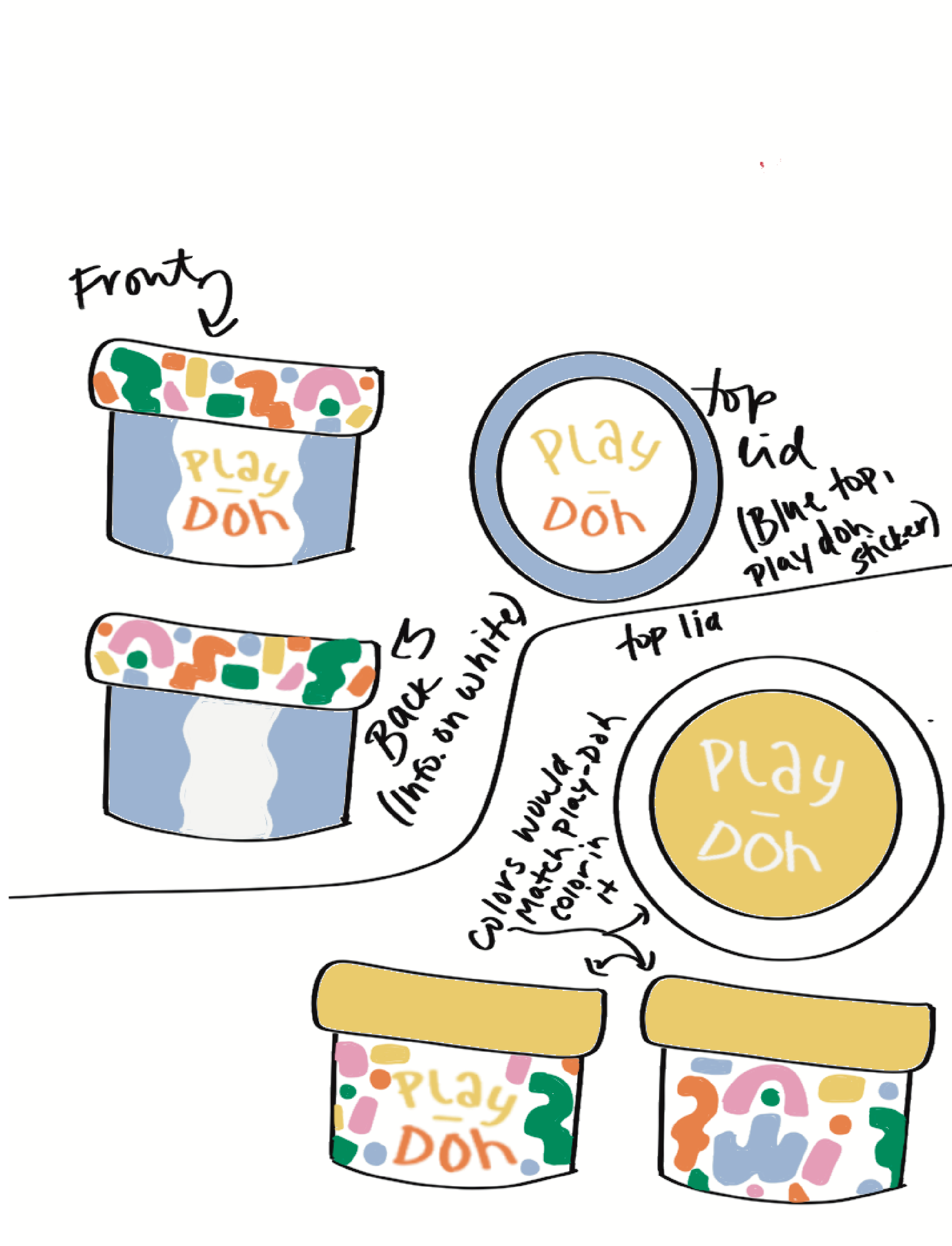
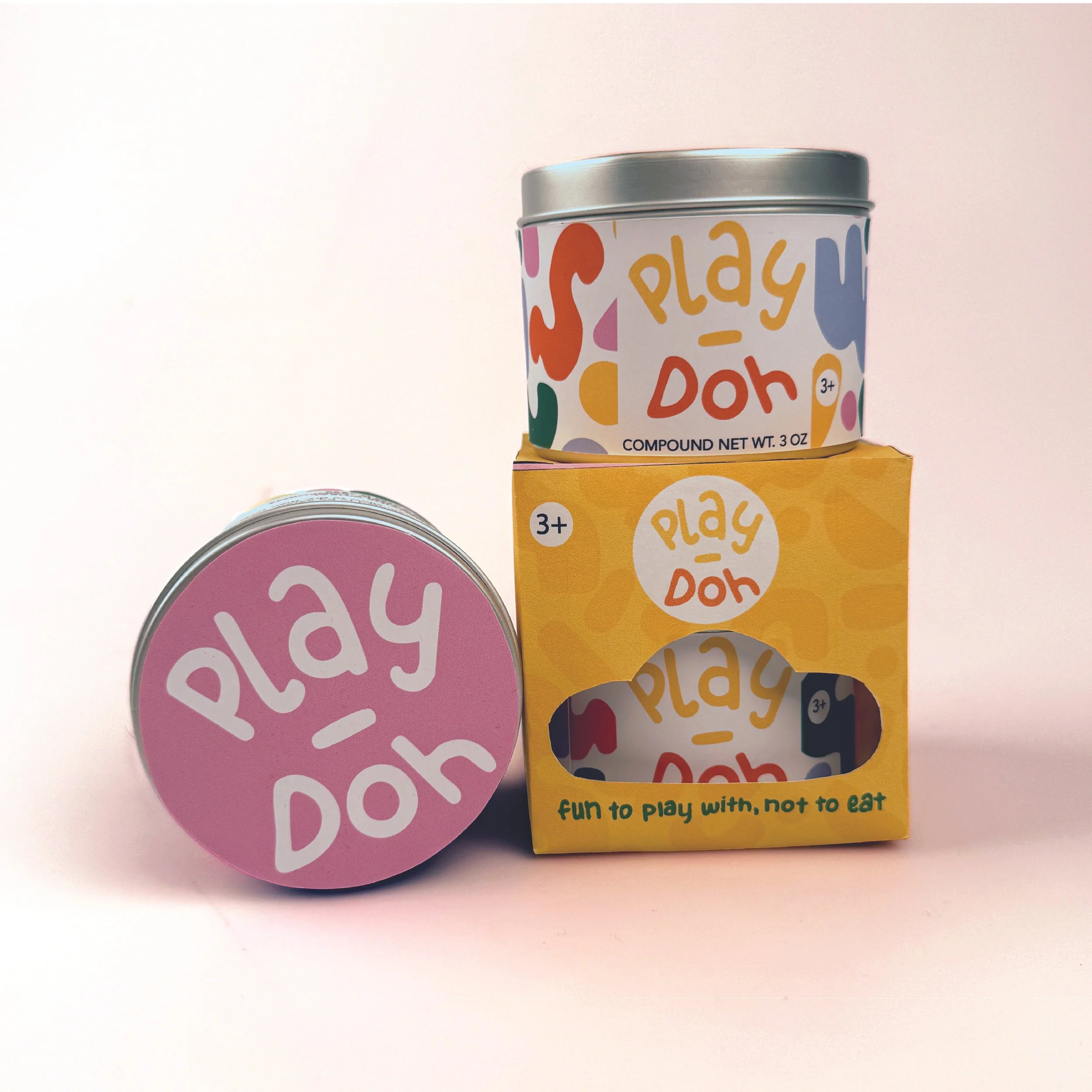
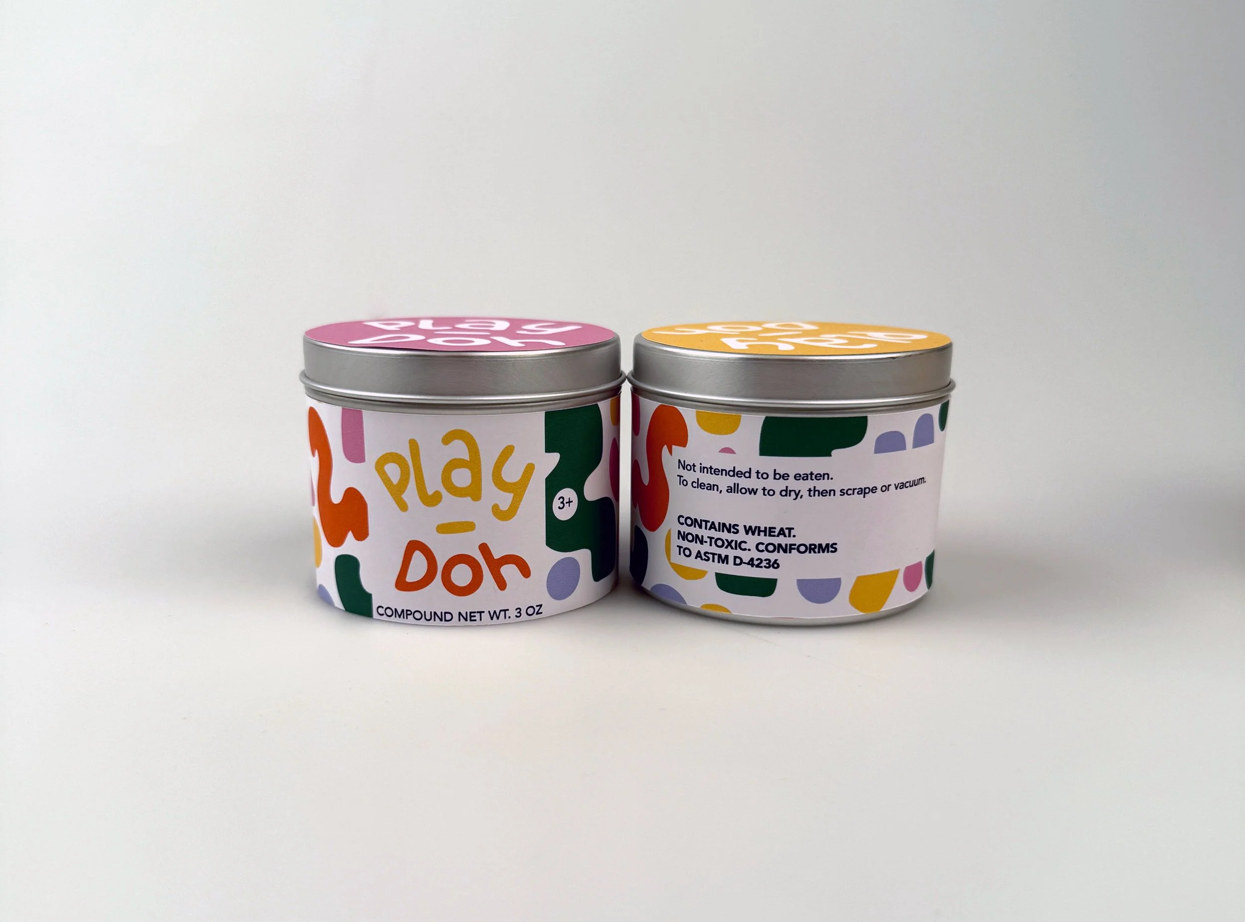
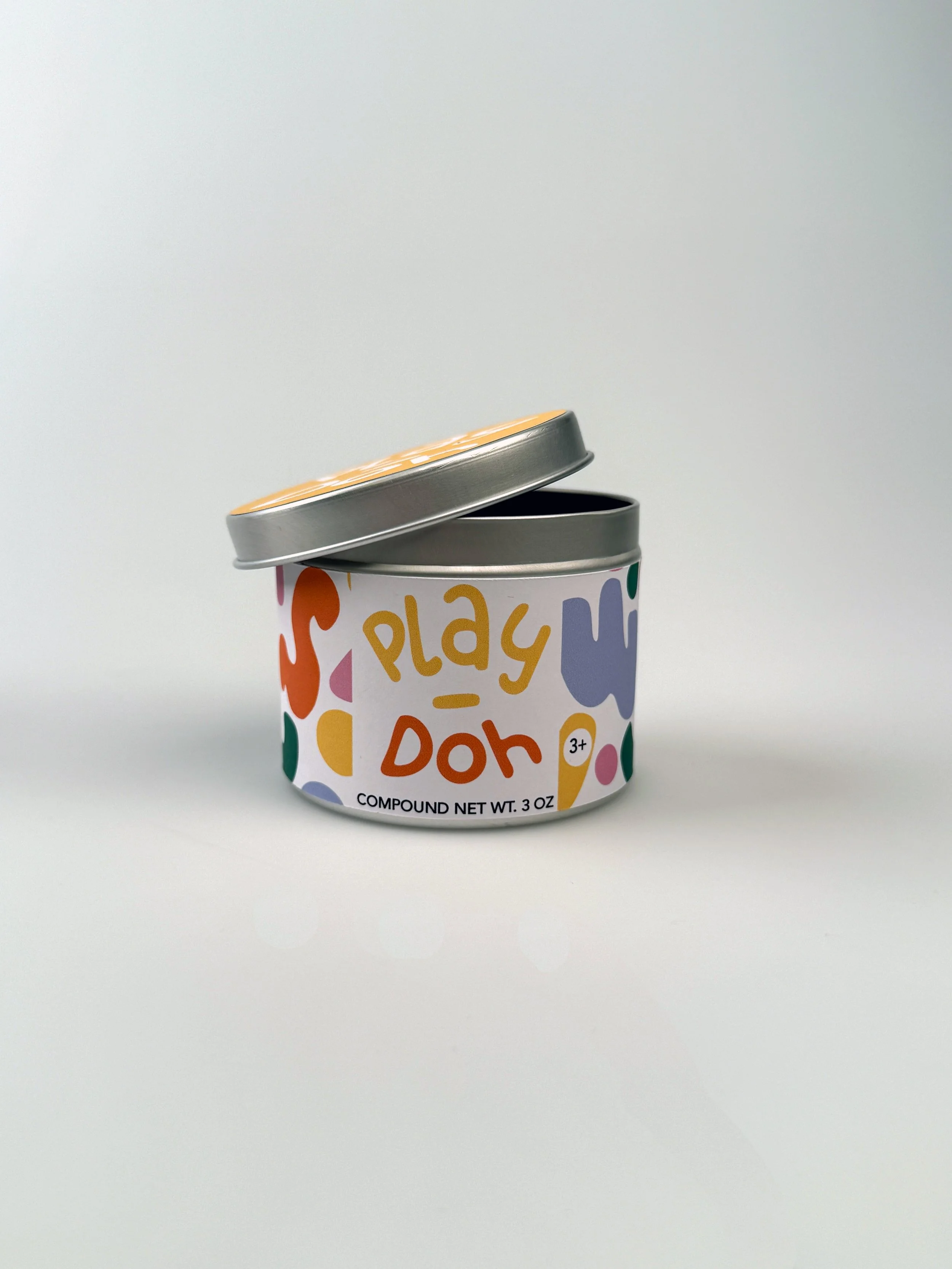
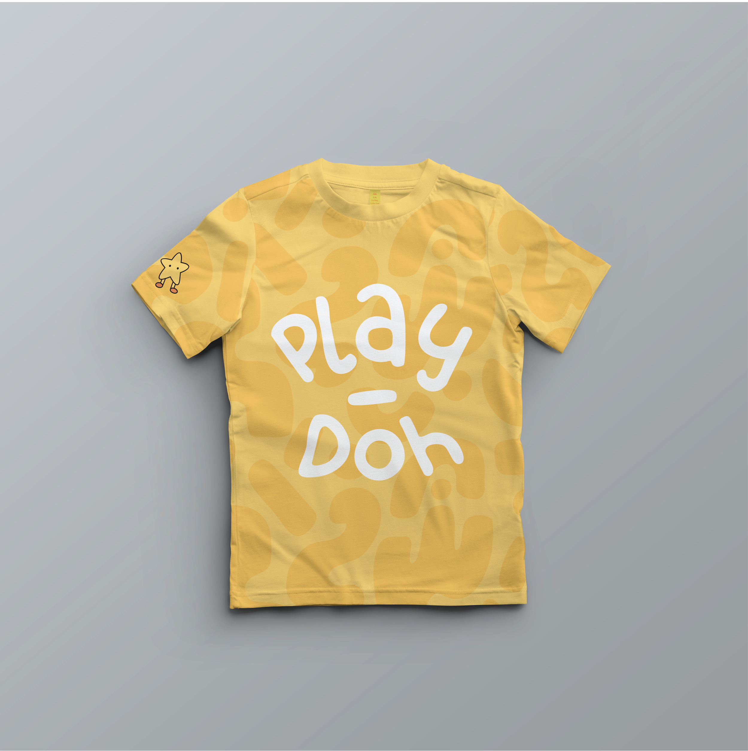
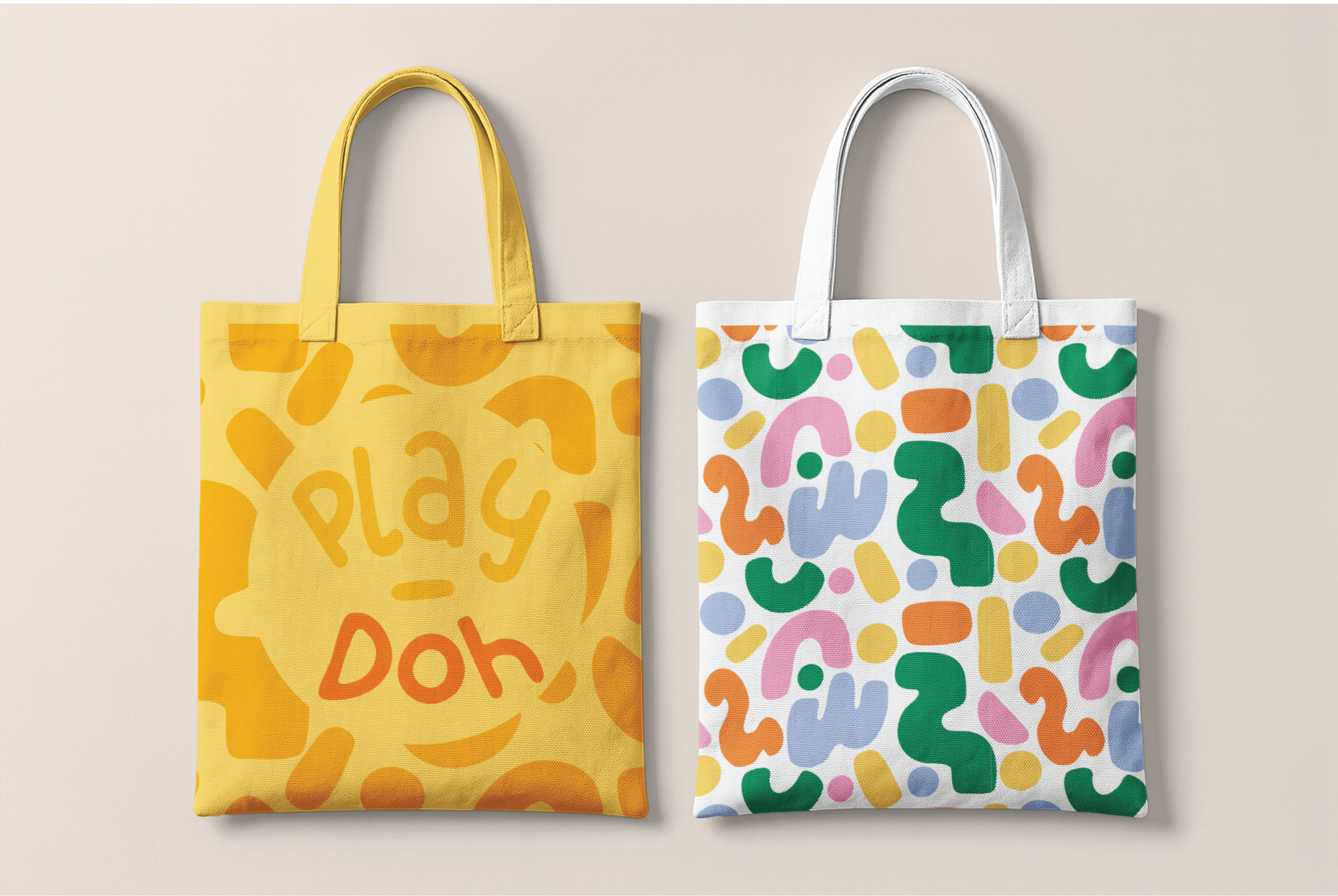
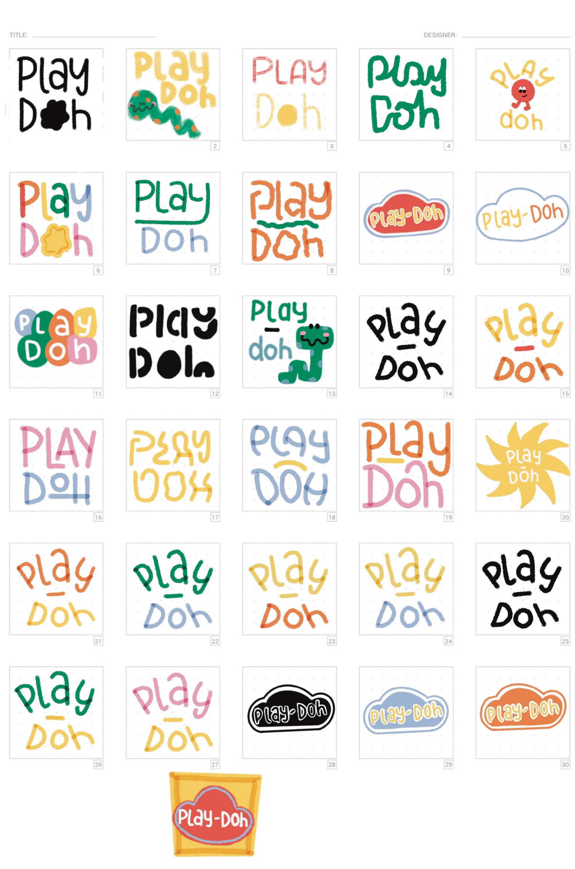
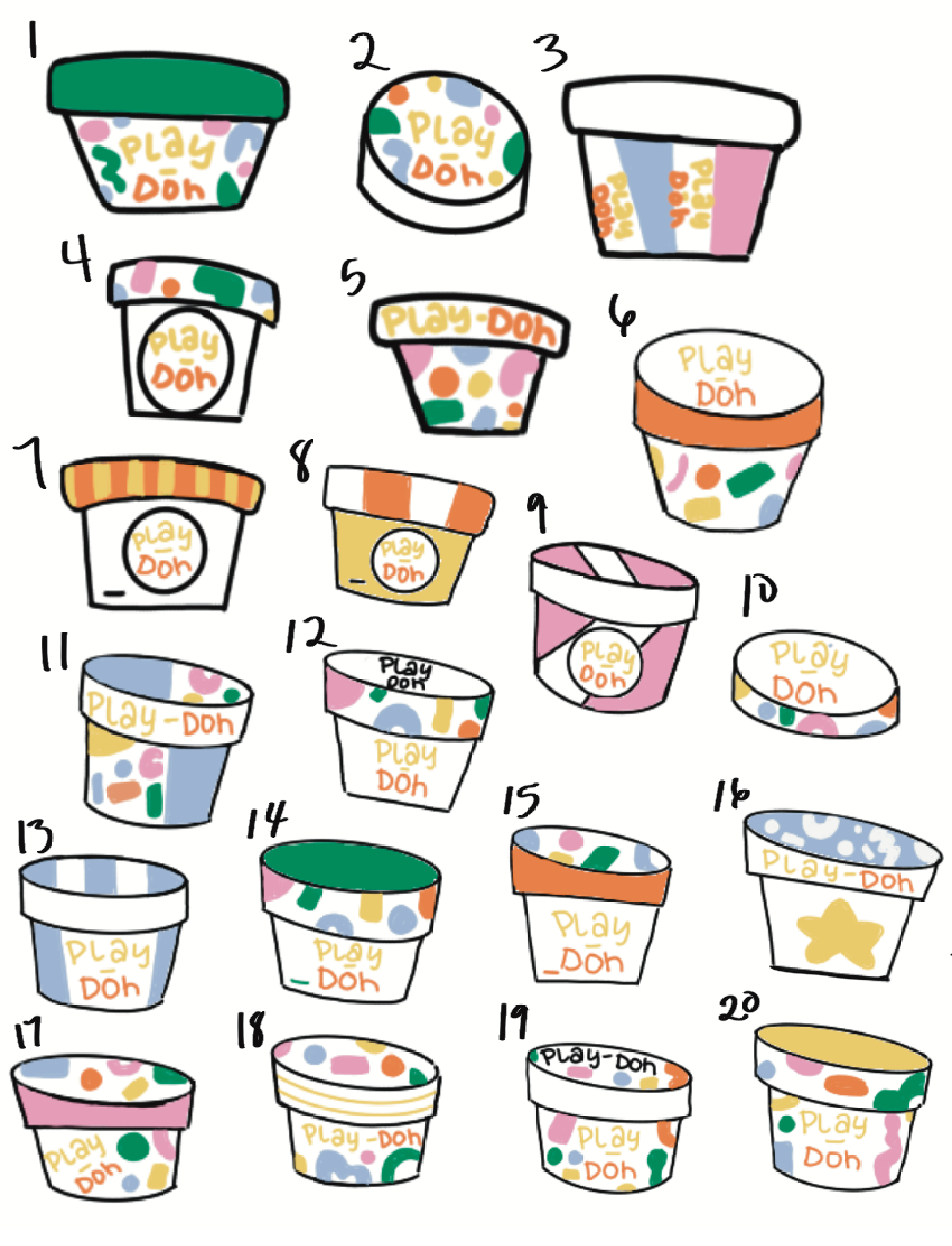
The design approach was inspired by organic patterns of shapes that kids’ make when playing with play-doh. The logo was meant to keep the same feel of the original but made to be more fun, and simpler. The color palette consists of their iconic yellow shade, and then has pastel shades of pink, blue, green, and orange. The pattern was put around the container with the logo at the front and on the top of the container, using the color that the play-doh resembles inside. My AR feature is on the box that the two eco-friendly containers of play-doh come in. There are two “Mood Buddies” that are happy and silly and if you scan them they come to life and do dances to songs that resemble their moods.

Final Product

Full Process
Research
Logo Sketches
Container Sketches
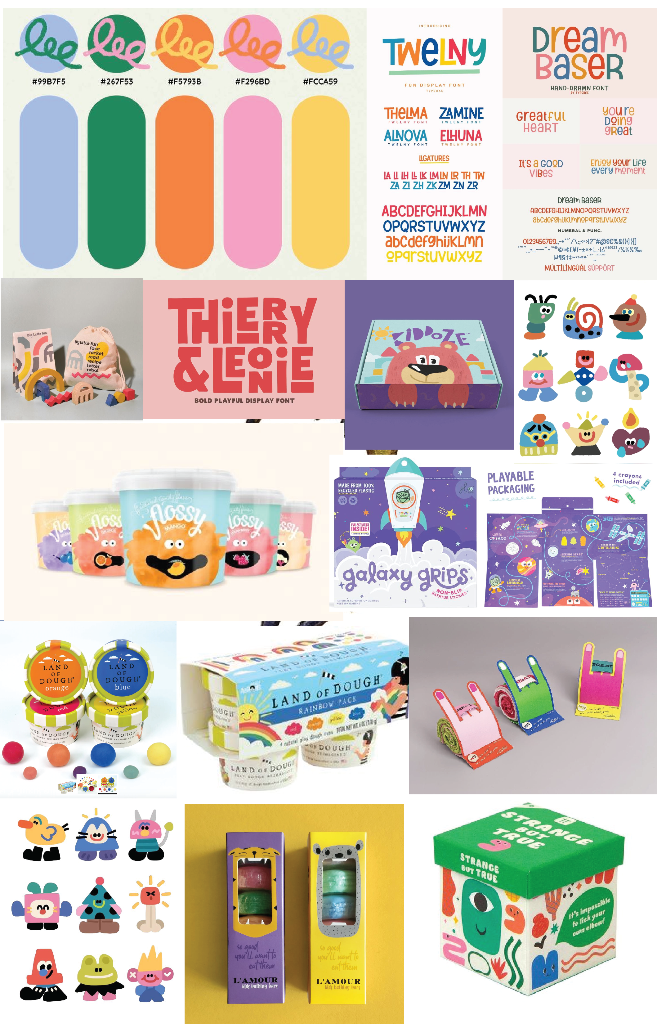
Mood Board
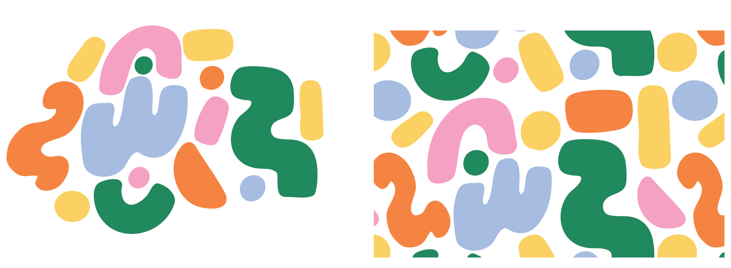
Pattern
Final Logo